 A couple of weeks ago, Tracey was asking me why some colors look better on people that other colors. “Maybe you can explain it on Creative Perspectives,” she suggested. Well, that’s a tall order—books have been written about color theory & professionals charge an arm and a leg to give you a personal color session.
But it’s possible to explain the basics in short order. In fact, I had fun yesterday playing with a personal color palette.
My personal color palette
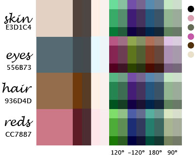
First I took a close-up photo of myself in daylight. I brought into Photoshop and sampled the color my skin, eyes, hair and the red of my lips (which should be about the same color as when I blush).
From there I played with a nifty color tool Color Coordinator which allowed me to enter a color value (which I noted from my photoshop sampling) and view monochrome values (the first two columns above), alternate complements (120ş & -120ş), complementary (180ş), and one of the tetradic colors (90ş) on the color wheel. I adjusted brightness in horizontal bands and saturation in vertical bands to give a wider range of examples for each color.
And it turns out that some of these colors are already in my wardrobe. I noted the general colors of my current wardrobe in dots along the side. I’m not doing too badly, though I suppose I need more blue in my life.
Posted by kuri at June 04, 2005 12:26 PM