Tutorials
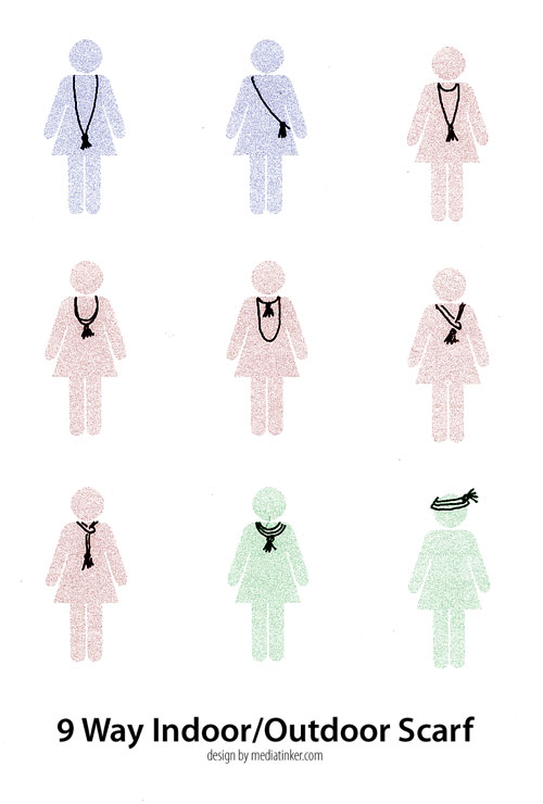
A couple of weeks ago, I bought some fluffy reddish yarn and decided to crochet myself a scarf that I could wear as an accessory in my chilly apartment. I wanted something long and soft and beautiful to wrap around my neck. I was a great idea, except I don't crochet well at all. So after I unraveled the wonky rectangle that I'd formed, I reverted to the one stitch I can do consistently - chain stitch.
The result was exactly perfect. I made a very long chain, wrapped it into a loop and attached a tassel. The scarf can be worn long (nice with a dress or tunic) or looped into shorter lengths in a number of ways. There are far more than nine ways to wear this.
9 Way Indoor/Outdoor Scarf
time required: about an hour
Materials
1 ball soft and fluffy yarn (the texture hide imperfect stitches!)
1 crochet hook (mine's 6mm or 10/0)
1 large yarn needle
scissors
- Make a tassel. I did mine by wrapping the yarn around my Moleskine notebook about 30 times, then slipped it off, folded it in half, tied it in the middle and again around the bundle to make a ball. Trim the ends and fluff as desired. Once you have your tassel, set it aside.
- Crochet a very long string. It should be nine to ten meters long depending on how long you want your scarf to be. (I looped mine around my neck and down as far as my belly button.) Depending on the size of your skein and how much yarn you used for your tassel, you'll get close to finishing it all.
- Loop the chain to make a circle with five strands on each side. I hung it over a hook as I looped to help me keep it even. At this point you can unravel or continue chaining to get the length just right.
- Connect the ends of the chain by crocheting them together or tying them.
- Attach the tassel. I used the tail ends of the chain to thread my needle, and sewed through the tassel, then tied the tails and threaded them vertically down through the tassel, trimming the ends to length.
To gift one of these scarfs (it's a quick and easy stocking stuffer), you can print a 4-up A4 sized version of the graphic (Download PDF) that shows ways to wear it. Quarter the page, roll and tape the sheet, and slide the folded scarf inside with the tassel hanging out.
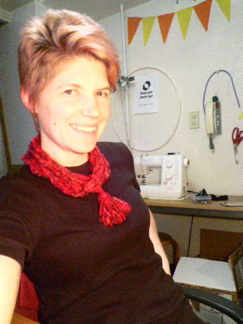
Me modeling one of the nine ways
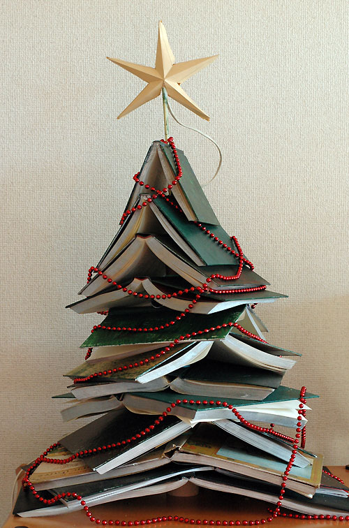
For the past nine years I've crafted a Christmas tree out of found objects, bits and pieces, useless odds and ends and occasionally a purchased item or two. This year, we had a box of books that we'd been trying to give away since the summer. A dozen hardcover castoffs became the foundation of the Christmas tree.
I am especially pleased with the way this tree turned out. But it was a 4-step process that took most of an afternoon, so I couldn't do the complete construction on Christmas Day in my usual tradition. Here's how it worked, in case you want to try one yourself.
Step 1: Drill This caused a bit of controversy in the household. Tod didn't want to hurt the books. I wanted to spike them so they wouldn't collapse. He went to work without a better suggestion and so I drilled the books by opening each book to its center spread, laying it page-side down and using a hand drill through the middle of the spine.
Mix and match painted covers
Step 2: Paint I silvered the edges of the pages with spray paint to make them consistent. The titles ranged from Great Grillin' to a 1963 children's edition of the Canterbury Tales and the covers were a range of tacky and plain so I decided to paint them with a mix of green acrylic paints. Because I like the artwork on the Canterbury Tales, I left that one unpainted and dry brushed any of the beige books to coordinate, while giving good coverage to the blue, black and red tomes.

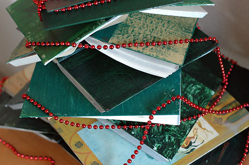
Spools of thread between books make space for lights
Step 3: Assemble This was a little bit harder than I expected. It took several attempts to get the spacing and shape right so I was sliding books on and off my dowel rod multiple times. The dowel I used was thin and flexible, so the tree leans a bit. I slipped a small spool of brown thread on the dowel after each group of three books. This enforced a few inverted Vs big enough for the lights.

Just like a real tree, I need to rearrange the lights - there are some dark patches!
Step 4: Light I topped the dowel with a cut-and-glued star made from a manila envelope, and tucked a string of colored bulbs in the spaces between books. This makes the tree glow gently in the dark.
Reduction printing is a way to make multiple color prints in limited edition series. Unlike traditional block printing where each printed color is a separate piece of carved medium, in reduction printing you use only one block. As you work, you build up the colors of your final picture after carving away more and more of the print block. Because you are destroying the previous layer as you create the next one, the final prints can never be reproduced.
In this tutorial, youŌĆÖll work with a rubber eraser as your print block. There are instructions to make two different four-color designs in limited editions. You can download a PDF booklet of the instructions and add the necessary materials to create a mini craft kit to give as a gift. Or follow along here for your own fun crafternoon.
You will need:
two plastic erasers
one craft knife
four stamp pads (sky blue, green, dark blue, black)
printing sheets
tape
square
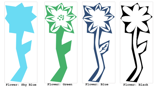
Print 1: House

The completed House print
This is a simple four-color reduction print, where each new color adds detail to the layer below it.
1. Four an edition of ten prints, count out 14 printing sheets. I always print a few spares to compensate for the inevitable mistakes. Remember that you can never make more because you must cut down the block to finish the print.

House: Sky Blue layer
Using your craft knife, cut away the area for the clouds as shown in the House: Sky Blue image. Print the sky blue ink once on each printing sheet. Allow to dry.

House: Green layer
Next, using House: Green as a guide, cut away everything that wonŌĆÖt be printed in green. This preserves the blue sky and creates a base for the house and tree. Paying close attention to aligning the colors (see note on registration below), print over your sky blue layer with the green ink. Print all the sheets and allow to dry.

House: Blue layer
Now, using House: Blue as a guide, cut away the areas that will remain green, keeping what will be printed in blue. Print dark blue over the other colors, paying close attention to color registration. Allow the sheets to dry.

House: Black layer
Finally, with House: Black as a guide, cut away the areas that will remain blue, leaving only the house details and tree trunk. Print black over the other colors. Allow prints to dry.
Print 2: Flower

In this reduction print, details are added in multiple colors as the general shape is revealed.
Count out printing sheets for your edition. Remember that you need to make a few extras to cover any mistakes.
Cut away the white area as shown in the Flower: Sky Blue image, below. Print the sky blue ink as many times as you want prints. Allow to dry.
Using Flower: Green as a guide, cut away the center area of the flower, keeping the petal details and center of the flower. Carefully registering the block, print over the sky blue layer with the green ink. Print all the sheets and allow to dry.
Using Flower: Blue as a guide, cut away the stem, leaf, and center areas that will remain green. Print dark blue over the other colors, paying close attention to color registration. Allow the sheets to dry.
With Flower: Black as a guide, cut away the leaf and flower details that will remain blue. Print the final black over the other colors. Allow prints to dry.
Note: Printing and Registration
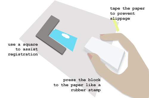
Aligning the color layers is critical to having a neat finished print. With small print blocks like rubber erasers, use the block as a rubber stamp. Tape each printing sheet paper to table to prevent it from slipping and align the corners of the print block to the previous color layers using a square.
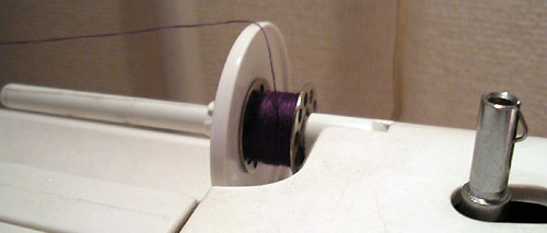
Now that I have a serger, I adapt a lot of my patterns to use it. Today I'm making a dress that can be 95% overlocked. But zippers and darts still need the conventional sewing machine and I want matching thread for these seams. Instead of buying a separate spool of thread, I've wound a mini-spool from my cone of overlock thread.
It's easy to do. Put the overlock thread cone in a coffee mug on the table behind the machine - this will prevent the it from bouncing around as it unspools. Use this thread to set up your bobbin-winding apparatus as usual and wind two bobbins from the cone. Use one in the bobbin case and slip the other over your machine's spool rod. Voila! enough thread to do darts, zippers, and hems.
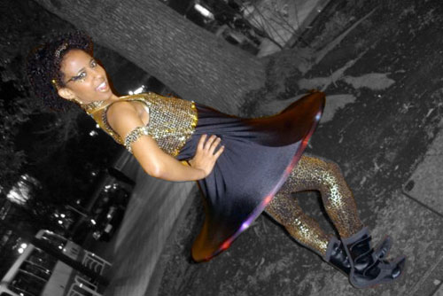
Leila rocks her hoopy dress with an LED hula hoop in the hem.
I made this bouncy dress for a friend who had a mission. I can't reveal what the mission was, but the dress was so fun that I want to share the technique with you. It's not a pattern, per se, as the dimensions will vary depending upon your fabric and hoop size.
You will need:
1 hula hoop
1 tank top pattern
2 meters 4-way stretch lycra, a bit more if you want a longer skirt.
1/2 meter stretch fabric for the top
1-3 meters stretch trim (optional)
Calculating
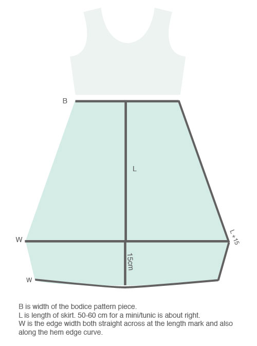
The trickiest bit of this process is calculating how wide the dress has to be at its widest point and along the bottom hem curve. You need to know how stretchy the fabric is and how big the hoop is.

Patterning
If you have a tank top pattern that you like, trace it out and adjust it to be empire length so that it ends just under the bustline. For a relatively flat chested girl like me, that's about 12 cm under the armpit. If you don't have a pattern you like, you can trace around a finished tank top that fits well. Don't forget to add a bit for seam allowances. Cut two tanks (4 pieces total) - one in the outer material and one in the lycra for a lining.
For the skirt, you'll do a bit of measuring (see below) using the calculations you did a few minutes ago. Pattern paper or newsprint comes in handy here! Don't forget seam allowances but you won't hem the skirt. When you have the skirt pattern measured and drawn, cut two pieces from lycra. Don't forget seam allowances.
Sewing
I use a serger/overlocker, but if you are using a regular sewing machine, be sure to use a zig-zag stitch to allow for stretch.
First construct the lined bodice. Sew the outer bodice together at the shoulder seams. Repeat for the lining. With right sides together, sew lining and bodice together around the neckline. Turn right side out.
Here is a nifty magical trick that lets you sew the armhole seams. Follow the diagram below. The neck adn armhole seams will be enclosed and the side seams will be open when this is done.
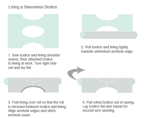
Sew the left side of the bodice together; leave the right side open for now:

Sew the left side of the skirt together. Sew the skirt to the bodice, matching the side seams. If you are going to trim the dress along the bodice edge or at the hemline, do it now while the dress is flat. Sew the left side from hem all the way up the bodice and bodice lining.
Wearing
Slip the hoop into the dress and stretch the bottom hemline over the hoop. This can take some fussing, yanking and pulling as you want the hoop to be centered in the dress. You will have about 15 cm of fabric under the hoop as a shelf to hold the hoop in place.
Click for larger version, or download the PDF
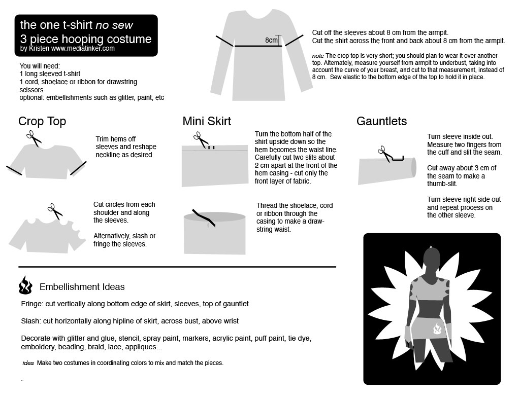
As presented at Spin Matsuri, a quick, inexpensive way to create a costume base that is suitable for hoop dance. Also makes a good superhero costume if you add a cape. Add your own style with fringing, slashes, bling or paint.


Hooper trading cards! Thanks to a funny comment by my husband, hooper trading cards are unleashed on the Internet. Collect them all! Trade online - use them a profile photos - print them out - add stats on the back as you like. There's a group at Flickr to share them, too.
These are the first four in the series - me and some of my hooping friends. Let's make hooper trading cards for all our hooping buddies and superstars.
Make Your Own
Download this Photoshop CS3 template. Place your photo, type in your name and location, then adjust the visibility of the colored bits. Save as a jpg and Voila! Your own trading card. Use the template back to organise your hooping stats.
 Hooper Trading Card template (PSD, 572KB) |
 Hooper Trading Card template back (PSD 488KB) |
 |
Request a Card
If you don't have Photoshop, I can make your card for you. E-mail me (kristen@mediatinker.com)
1. your full-body hooping action shot (640x480 or larger),
2. your hoop name,
3. city, state/country,
4. preferred border color from these options:
Please note that card production may be delayed until the end of April.
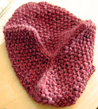
 I haven't learned to knit in the round yet, but I wanted to knit a hat so I devised one made of three rectangles sewn together. It turned out well and friends have asked me to make more.
It's simple, using only 2x2 rib stitch, moss stitch and a simple increase (or decrease) so I thought I'd write up the knitting pattern and share it.
I'm sure this first attempt at a knitting pattern is going to be pretty awful. Feel free to suggest corrections and improvements. For example, this pattern has no real gauge, but my finished hat is 13 stitches, 22 rows in a 4" swatch. I knit loosely.
Kristen's 3-Eared Hat
Materials
#10 needles, 22 cm
1 ball (50 g/~100m) DK or worsted yarn
yarn needle
Procedure
Cast on 26 stitches*, leaving a 20cm tail.
Row 1-8: k2 p2 to end
Row 9: k1 p1 (repeat for12 stitches), k2tog, p1,k1 to end
Row 10-37 (?): k1, p1 to end
 You will need to measure your head to decide where to stop. I did this by holding the rectangle to my head and when it reached from just above my brow to the crown of my head, I cast off.
Repeat to make 3 rectangles.
Finishing
Mark the top center point of each rectangle. Using the long tails, stitch the pieces together to form a tube. Bring the marked center points together in the middle and sew the top closed, forming a Y (see photo). If you have extra yarn and want a super-cute hat, sew tassels or pompoms to the points.
* For a hat with tighter ribbing, cast on 24 stitches, do the ribbing rows, then increase (make one) instead of k2tog on Row 9.
My friend Ellie carries her own chopsticks with her wherever she goes so that she doesn't have to use disposable chopsticks at restaurants. Each year, 25 billion pairs of disposable chopsticks (waribashi) are used in Japan. That's 200 pairs per person. There are a few recycling programs, but most used waribashi get thrown into the garbage. What a waste.
Ellie carries her "My Hashi " in her purse, protected in a roll of fabric. She'd like to make a few of these as gifts, but wasn't sure how to do it. So we sat down over a cocktail and I reverse-engineered the design. It's really simple and clever.
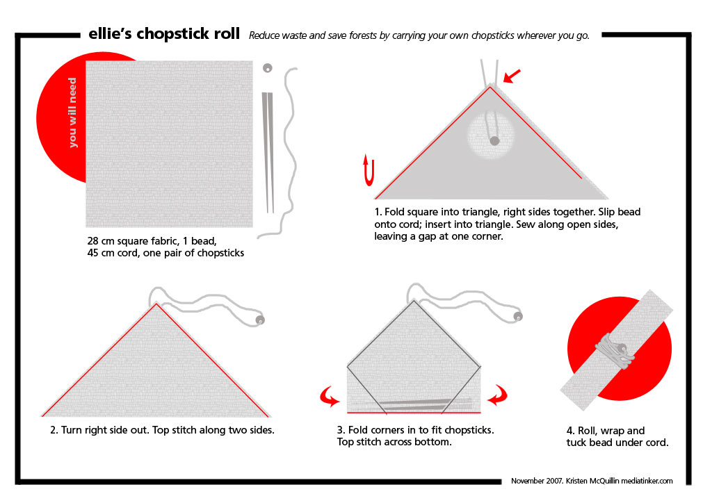
Download instructions
A4-size PDF 555K
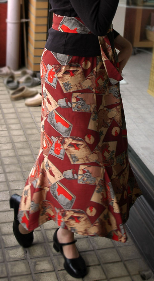
Flared skirt in action
I bought some crazy kabuki ghost fabric a few weeks ago and it's been sitting around waiting for me to need a new skirt. Finally, I had a need for a nifty outfit, so I designed a flared skirt and whipped it up between breakfast and leaving the house. It's comfy stylish and easy to wear, so I wrote up the pattern in case you want to make one, too.
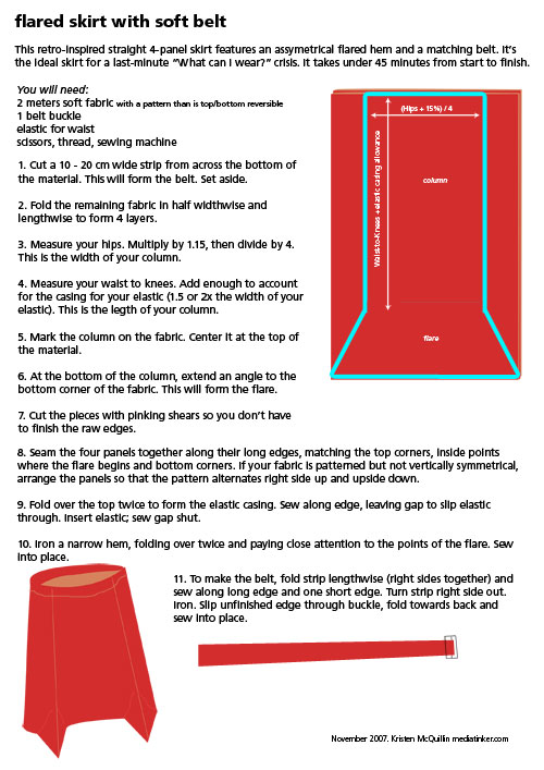
Download the pattern A4 PDF 248K
About five years ago, I taught a workshop on Digital Photography to an audience of DigitalEve members. Today I found the materials I used and realised that they are still useful, excepting some time-sensitive bits about price, online services, and upcoming DE events. It's embarrassingly full of photos of me and Zoupi, but I didn't have another model handy when I was getting ready for the workshop.
The original workshop was 3 hours long and geared towards novices. I'm sure everyone and her dog knows this material now, but in case you need a refresher or are curious about the state of digital photography in 2002, here's what you'll find in the PDF of the handouts linked below:
- Overview of hardware
- Secrets of taking good photographs (digital or otherwise)
- "Photo safari" where everyone went out to take photos
- How to get the pictures from the camera to the computer
- Image editing hits and tips
- Photo sharing options
Digital Photography (21 MB PDF)
Download the PDF (345 KB)
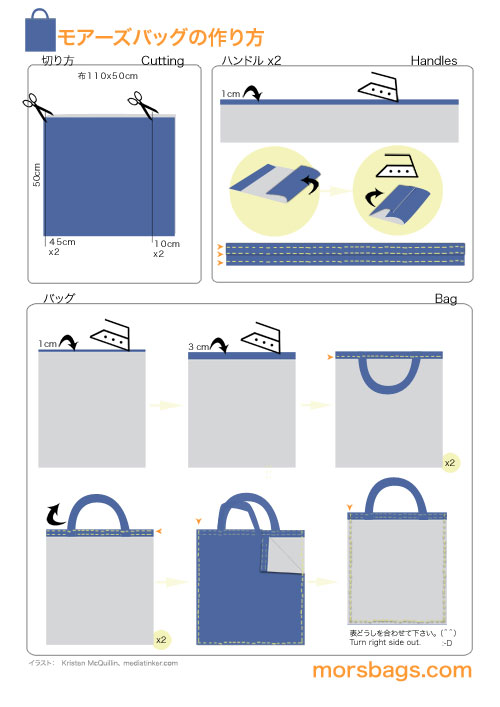
I love the simplicity of the Morsbag pattern, but the original written instructions were not going to work for non-native English speakers. I recreated the pattern from scratch in pictures with minimal text. I think this is pretty easy to follow no matter what language you speak. What do you think?
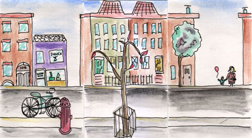
An urban myriorama of three cards. Click to see another arrangement
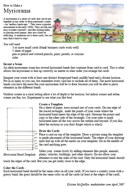
A myriorama is a panorama made of little cards that can be arranged in any order - the "endless landscape." They were popular in the early 19th century. I was playing around with a reproduction of one today and decided to try making my own. It was so much fun, I thought you might like to try it, too.
Download a printable tutorial: How to Make a Myriorama 296 KB PDF
My sister coined the word knitangle to describe all those wonky rectangles we beginners knit and crochet. I have a stock of them and until I learn to increase and decrease, I'm going to make quite a few more. But I hate the thought of all that knitting going to waste or being unravelled. Enter Knitangle - ideas for reclaiming knitted rectangles - with tutorials for making projects from simple rectangles. I suppose you could even knit a rectangle on purpose to try the project.
The Knitangle project sheets include a photo of a finished item, a materials list and illustrated instructions. Expect them as an irregular mediatinker feature until I am done with my stash or take the time to learn some new knitting tricks.
![]()

The first Knitangle: tassled hat from a 3:5 rectangle
Download the Knitangle Tassled Hat project sheet (180KB PDF)
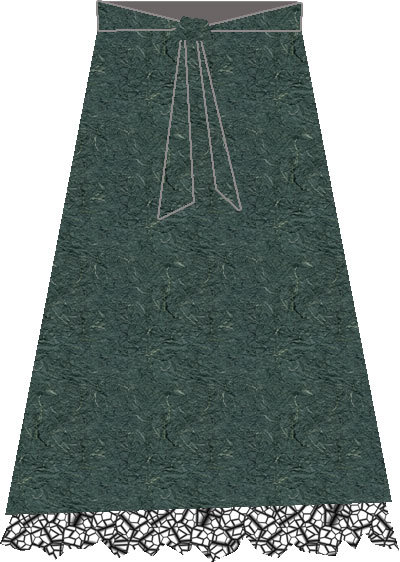
This long A-line skirt has a tulle-edged slip peeking out from the bottom, soft wide waistband, and back sash/bow detail. It sews up in under three hours. Perfect for a last minute holiday outfit! There will even be scraps enough to make a matching bag.
Materials
3 meters cotton or lightweight wool fabric
2 meters lining fabric for slip
2 meters tulle for slip
30 cm zipper
1/2 inch waistband elastic
thread
Measure
A: Waist - at natural waistline
B: Hips - at fullest point
C: Waist to Hips
D: Waist to Ankle
E: Stride - take a comfortable step in your party shoes and measure front toe to back heel
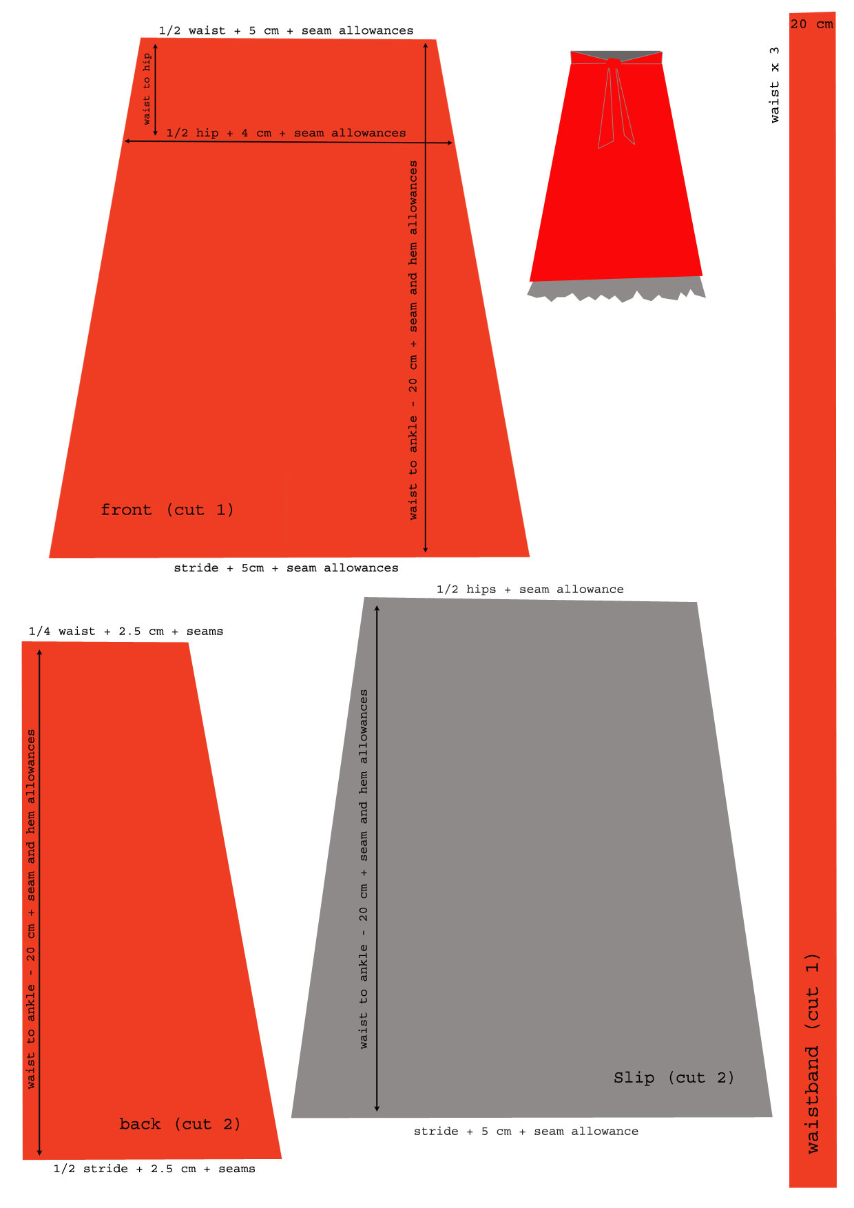
Click for larger image, or download a printable PDF
Cut
- Using the illustration or printable A4 PDF as a guide, measure directly on the fabric and cut the skirt front, back, and slip.
- You may choose to piece the waistband in three sections if your fabric has a directional pattern, otherwise cut it in one piece lengthwise from the side of your fabric.
- Cut the tulle in half lengthwise.
Sew the Skirt
- Sew the back seam together, basting at the point along the section where the zipper will be.
- Insert the zipper (centered or invisible).
- Sew the back and front of the skirt together.
- Baste along the waistline.
- Place a pin at the waist center front.
- Fold waistband in half lengthwise and iron.
- Place a pin on the waistband at the center front. From there, measure 1/2 the waist size and place pins to guide on either side of center. Also pin at the 1/4 waist measurement points; these will line up with the side seams.
- Pull up the waistline basting into light, even gathers to fit the pins on the waistband.
- Sew the waistband to skirt, matching pins and side seams.
- Iron waistband seams up, and raw edges of waistband towards inside.
- Topstitch waistband and sash from edge to edge. You may choose to mitre the ends of the sash by folding them diagonally to the inside, or leave them square.
- Hem the skirt.
Sew the Slip
- Sew the side seams together.
- Hem the bottom.
- Double fold the top to form a casing.
- Sew casing, leaving opening.
- Insert elastic into casing. Stitch closed.
- Overlap the two long tulle pieces to form one 4 meter long strip but do not sew together.
- Fold strip in half lengthwise.
- Baste along folded edge of strip.
- Try on slip. Decide where to sew the tulle so it skims the floor or hits your ankles. Mark point on slip.
- Gather tulle evenly to fit around slip.
- Sew tulle ruffle to slip.
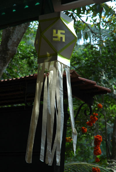
Lantern Decoration in Goa
Diwali, the Hindu festival of lights that launches a two-month festive season, had just ended when we arrived so everywhere we turned, we saw decorations. One of my favorites were these large lanterns with streamers. I decided to make my own on a smaller scale for holiday parties. Because they are so simple and fun to make, I want to share the pattern with you.
Indian Party Lantern pattern (248K PDF)
You will need:
Paper, construction paper, card stock, thin Styrofoam (reuse those meat trays!), or stiff plastic
Tape (colored or clear)
Scissors or craft knife
optional: ribbons for streamers; cord for hanging
The pattern is designed to make a softball sized lantern from a sheet of A4 paper, so if you can print onto your paper of choice that's easiest. Otherwise trace the pattern onto your lantern material.
Cut out the shapes. If you wish, you can cut a decorative shape from the center of the square pieces and back it with colored plastic as in the lantern pictured above.
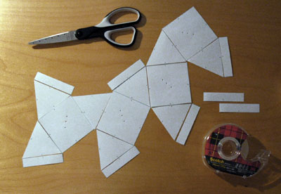
Arranging the pieces on the table before taping makes it faster to assemble
Arrange the shapes by matching the letters on each side. C matches to C, e to e, 6 to 6, etc. This forms a surprisingly un-lanternlike shape. Do not panic; it will all come together.
Tape the pieces together one at a time. Do not overlap - keep the pieces barely touching (if your material is thick, add a gap to allow the seam to fold later). Do your best to center the tape over the seam.
After taping the pieces together flat, crease the seams. This makes sharp edges when the lantern is finished.
Now match and tape the remaining letters and short edges of the rectangles to form the three dimensional shape of the lantern.
If desired, finish with streamers and sew a cord across the top for hanging.
Notes:
To make a different size lantern, cut 4 squares, 8 equilateral triangles, & 8 rectangles. The sides of the squares, triangles and long edge of the rectangles will all be the same length.
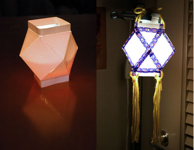
Completed lanterns: as a luminaria. and shading a bulb in my studio
For our upcoming trip to India, I wanted a lightweight, appropriately modest skirt that would be comfortable to walk in and also easy to pack and hand-wash in hotel sinks. I came up with this straight line, mock wrap skirt in linen.
It has a separate elastic waistband that allows the panels of the skirt to be s-folded to form the wrap before the waistband is applied. I'm sure this is standard technique, but I've never tried it before. Works like a charm, I must say.
The whole thing is made of rectangles, so you only need to do some measuring and cutting. I wrote up an illustrated pattern with instructions, which you can download for free. The pattern includes the measurements for cutting, a list of materials, and a larger version of the image below.
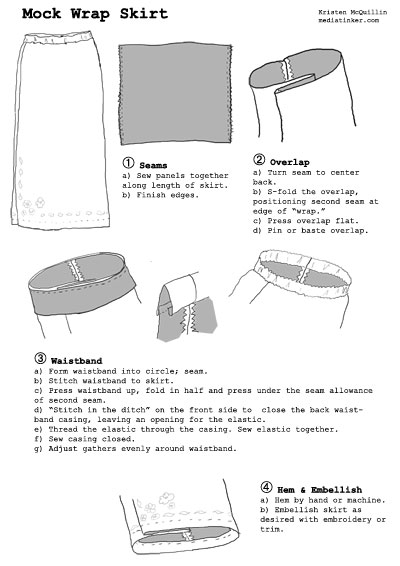
Mock Wrap Skirt Pattern 492 KB PDF
Please don't resell this pattern or pass it off as your own work because I will get annoyed when I find out.
 Earlier this summer, there was a craze in the sewing/crafting world for "wardrobe refashioning," taking an item of ready-made clothing and turning it into something else. There were some really clever ideas (here are some photos) and I wanted to play, too.
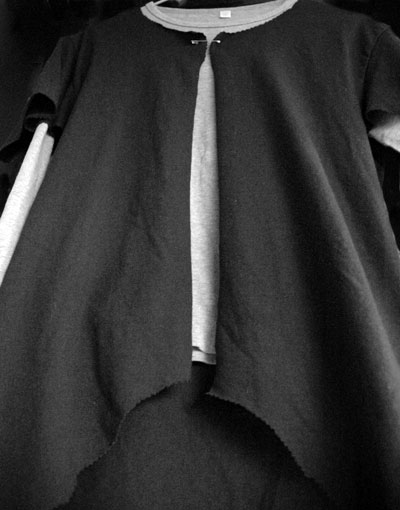
Finally, today, I grabbed a t-shirt I never wear - it's a little too long and tight - and turned it into a jacket. Took me five minutes to get the shape right with a pair of pinking shears. Now it's a flutter-sleeved, cutaway jacket/overshirt nd I can tell I'll wear it often.
I liked the results enough to write up an illustrated guide to doing it yourself. Writing the instructions took 2 hours. So much for getting any other sewing done today... Now here's your challenge. Reinvent one of your own ill-fitting t-shirts. If you like what you refashion, tell us about it in the comments.
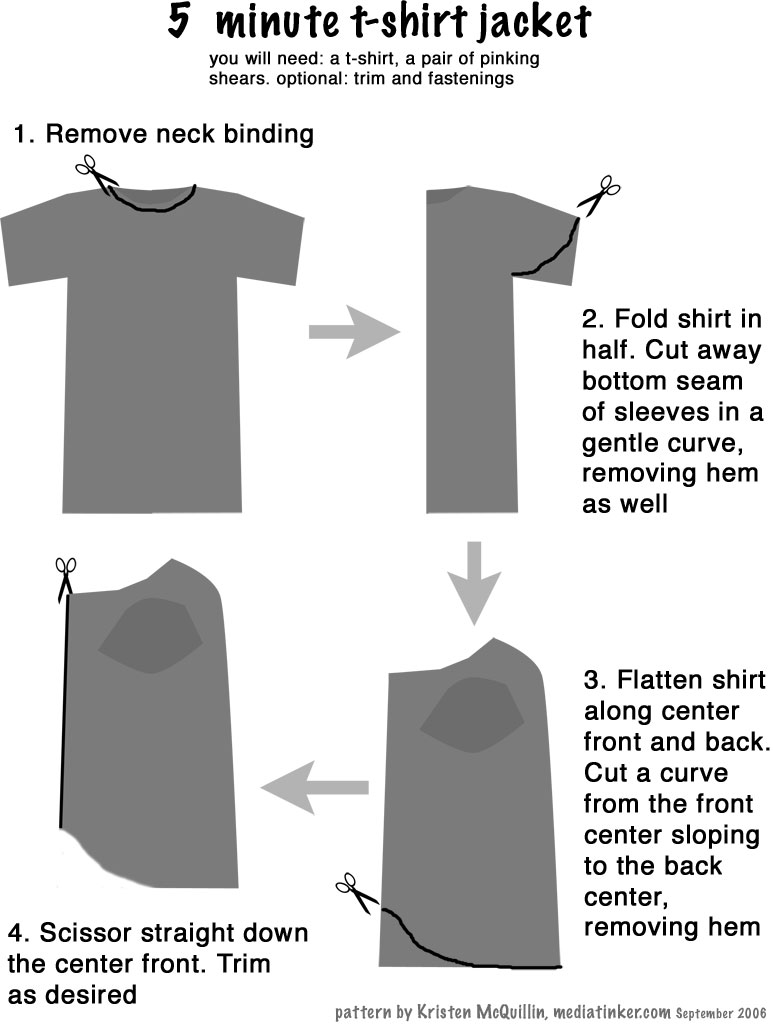
Click for larger image, or download a printable version: 5-minute t-shirt jacket (PDF 232K)
One evening last week in Matsudai, we heard the most delightful chorus of frogs - deep croaking, quick peeps, and a percussive almost wooden clapping. But as we approached the little garden pond for a closer look and listen, the frogs stopped their songs.
Kimie-san started talking to them. She called; they answered. We giggled. She called again and soon they were all chatting away. I was delighted. Her technique was simple.
She made a loud, hollow sound by closing her lips with air in her cheeks and in between her lips and teeth, then opening them quickly while sucking the air in. The resulting sound was a hollow, lip smacking pop. She repeated it a few times and the frogs talked back.
On another night, I went to the pond alone and tried it with the recorder running. It worked! Have a listen:
Frog Call 0'04" 72KB MP3
Step 1: Wait for a phone call from a desperate friend who:
a) had a model cancel at the last second;
b) didn't realise another model was needed; or
c) has a client with shifting requirements.
This is how I get all my modelling jobs. Yesterday Sayaka called me at 12:27. "Kristen, do you have some time? I need you." At 2 pm.
Step 2: Ask the friend, client or photographer what you should wear. Are you supposed to be a housewife, a teacher, an office worker, a date? Are there color requirements? Dig through your wardrobe and find something that will work (It is helpful to have a wide and varied collection of clothes that fit). Get dressed quickly, do your hair and face neatly. There will be no adjustments once you get there.
Step 3: Wait at the venue. They may say 2 pm, but that's when they start prepping the studio or shooting the products or other models. You will wait your turn. Bring a book.
Step 4: Get in front of the camera. Act natural. Smile. Look into the lens. Note the camera's make and model and what lens is on it so you can tell Tod later. Interact with the other models, as directed.
In my experience, most photographers just want you to stand or sit without moving around too much - forget what you've seen of fashion magazine shoots with models tossing their hair and striking poses. When you're in a picture for an event poster or a flyer, you're probably background for the text.
Step 5: Assure everyone that you are neither a model nor an English teacher. Hand out your meishi and tell them - especially the bosses - that you are a media editor (or whatever you are) and would be happy to hear from them if they ever need you in that capacity.
Step 6: Collect your stipend and go home. The total elapsed time from arrival to departure is likely to be around an hour, most of it taken up with Step 3.
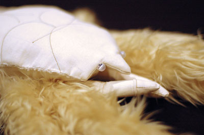
Ephrata Playhouse, where my mom's been doing community theatre for 20 years, is producing the gothic comedy The Mystery of Irma Vepp later this summer. So Mom called on me, creator of the life-like furry albino lobster pattern, to draft a pattern for a life-sized dead wolf to be dragged on stage in a hunting scene.
And here it is. I have not built this - only drafted the pattern and instructions - so I am certain some adjustments will be necessary in the sewing. My instructions are not extremely detailed. The wolf involves a fair amount of handsewing and a solid general knowledge of sewing. If you make the wolf and have any tips or suggestions, please leave a comment.
To aid realism, I studied the proportions, weighting and rigidity of dead wolves (through photos & scientific papers only; no animals were harmed in the creation of this pattern). The weight is added by stuffing the head, shoulder and hips with bags of rice, sawdust or beans. The legs are held stiff with dowel rods; the limitedly flexible spine is created with a series of interlocking plastic cups threaded together and tied off at tail and head. I recommend buying very long fake fur and giving your wolf a haircut when you've finished the construction.
Instructions (575KB PDF)
Pattern Pieces (1.2MB PDF) prints to 42 US Letter pages
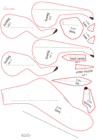
You'll need (approximately):
4-5 yards long plush fake fur
1 -2 yards muslin for constructing the bags
1/4 yard leatherette for nose and foot pads
1/2 yard rickrack or braided trim for eyes/mouth
15-25 pounds of rice, beans or sawdust
polyfil or chipped foam stuffing in great quantities
regular sewing thread
button or quilting thread
enough cups to make a ~50 inch stack
twine
Bees are attracted to light and move away from darkness and shadows. If a bee enters your room and buzzes against the inside of the window trying to get back out into the sunny day, and if you have access to the outside of the window, here is a sure-fire method for removing the bee without hurting it.
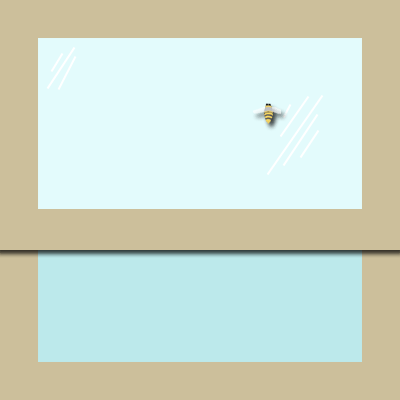
- Turn off all the lights in your room. The window should be the brightest source of light.
- Grab a newspaper, sheet of black paper, a large book or something else opaque but easily held. Bigger is better.
- Hold the paper against the outside of the window in front of the bee.
- The bee will fly out of the dark area and towards a lighter spot, usually still buzzing against the window. Sometimes he'll fly into the room, but don't worry, he'll be back at the window in a moment...
- Guide the bee towards the opening of the window by moving the dark spot closer and closer to the open edge.
- When the bee escapes, block the window opening with the dark sheet to ensure the bee flies away and not back in.
Alternately, if you don't have access to the outside of the window, you can hold the paper behind the bee to block the light from the room and slowly slide the paper (and the bee) towards the window opening, but this method isn't as reliable. For advanced bee removal from the inside, hold the paper between the bee and the window, but this puts you rather close to the stinging end of Mr Buzz.
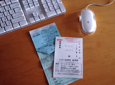
Japan's post office is very efficient. If you're not home when they deliver a parcel, they leave a slip with several options to get the package to you: stop by the post office in person, return a postcard telling them when and were to bring your box, make a phone call (in Japanese or English), or fill in a form online.
Today I figured out how to navigate the online system in Japanese. Here are instructions in English, so that you can do it, too. [nb: You must be able to type in Japanese with your computer]
URL
Go directly to the Redelivery Request Page or navigate from the Japan Post Home Page to ÕåŹķģŹķüöŃü«ŃüŖńö│ŃüŚĶŠ╝Ńü┐ÕÅŚõ╗ś
What
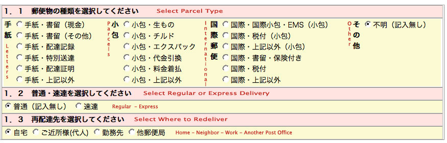 Step 1 (click for larger version)
STEP 1: Indicate what kind of parcel it is (as marked on the slip they left), whether is is regular or express mail, and where you want it redelivered. Then click the button marked µ¼ĪŃüĖķĆ▓ŃéĆ to go to the next step.
Where
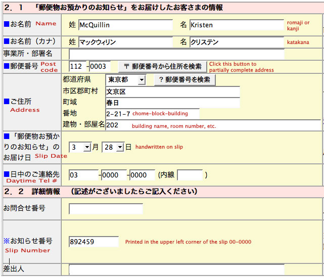 Step 2 (click for larger version)
STEP 2: On this screen, you must fill in your name and address where you want the package delivered. If you fill in the postal code and click the button next to it, the address is partially completed for you. Next comes the date the package was first delivered, folloowed by your phone number. Section 2.1 asks for the slip number. Click the button marked µ¼ĪŃüĖķĆ▓ŃéĆto go to the next step.
When
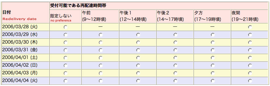 Step 3 (click for larger version)
STEP 3: Choose a date and time for redelivery. Click the button marked µ¼ĪŃüĖķĆ▓ŃéĆ to go to the next step.
Confirm
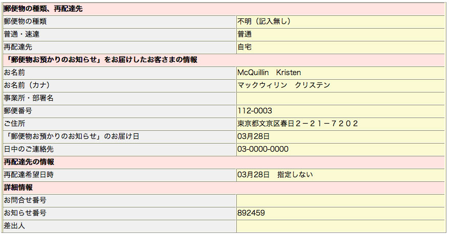 Step 4 (click for larger version)
STEP 4: Check your work. If there's a mistake, click the button marked ÕēŹŃüĖµł╗Ńéŗ to go back a page at a time and make corrections. If everything is OK, click ńÖ╗ķī▓ŃüÖŃéŗ. On the final screen, you will see ÕÅŚõ╗śŃéÆÕ«īõ║åŃüŚŃüŠŃüŚŃü¤ (completed) and will be given a confirmation number to use if there are any problems with the redelivery.
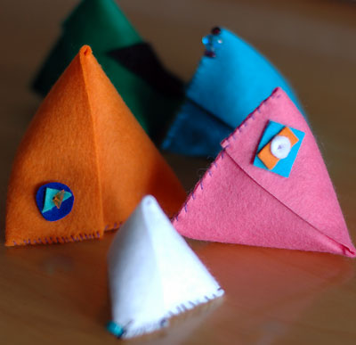
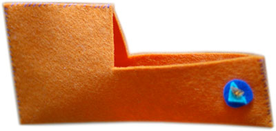
Tetrapouches
This is a flat pack, L-shaped piece that folds into a self-closing, 3D pouch.
Tetrahedrons, four-faced pyramids, are used for a wide range of items from packaging (tetrapacks) to weapons (caltrops). This soft felt tetrahedron makes a good coin purse, or in a larger size with a strap attached, a clever shoulder bag.
Tetrapocket pattern (PDF 444 KB)

This pattern is licensed under a Creative Commons Attribution-NonCommercial-ShareAlike 2.5 License.
Tasty
Inspired by the recently reported kiwa hirsuta lobster, I designed a plush toy. Although she's not anatomically correct in every detail (PDF), I think she is an identifiable member of this new species.
For anyone interested in sewing one of their own, I've developed a pattern with instructions and released it under a Creative Commons license. I don't recommend this project for people averse to hand-sewing or turning things inside out--there's plenty of both involved. But it's all simple sewing and assembly if you understand the basics of seaming and stuffing.
"Tasty" stuffed lobster pattern & instructions: 4 page A3 size 700 KB PDF
"Tasty" stuffed lobster pattern & instructions: 10 page Letter size, 1.1 MB PDF
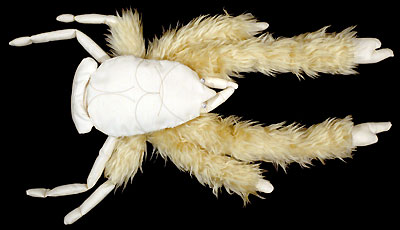
Kiwa hirsuta rendered in muslin and fur (dorsal view)
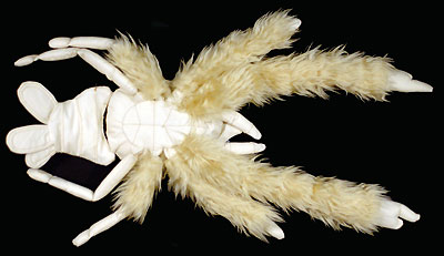
Tasty the lobster (ventral view)

The original kiwa hirsuta lobster, discovered in the depths of the Pacific Ocean.
This pattern is licensed under a Creative Commons Attribution-NonCommercial-ShareAlike2.5 License.
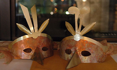
Copper and brass bird masks
I fashioned these masks for a masquerade ball we attended last week. They are rustic but elegant and not too difficult to make. And if you are careful not to dip your beak in it, you can sip a glass of wine or champagne while wearing your mask.
If you'd like to create one of your own, allow four or five evenings to cut, file, and assemble the mask. The cost of materials for two masks was under $20 (in Tokyo), not including tools.
Materials & Equipment
.2mm copper sheet
.2mm brass sheet
.45 mm copper wire
1.5 m soft ribbon
felt (optional)
pattern (2 MB PDF file)
construction paper
scissors
permanent marker
tin snips
drill with 0.8 mm bit & 2.5 mm bit
metal adhesive ("super glue" type)
paper clips (plastic covered ones prevent scratches)
large binder clips
half-round jeweler's files, medium and fine
needle-nose pliers
wire brush
barbecue tongs
salt
gas flame
cold water
Design
I tested a few designs with paper, cutting them to fit my face, before I started in on the metal. The pattern I've provided is my original and you can see the marks I made on it as I worked out the shape. You will need to adjust it for your own face, especially the width of your nose and size of your eyes. If you adjust the nose area, don't forget to reshape the beak to fit.
Cut
Trace the paper pattern onto the metal sheets with permanent marker. Cut the metal using tin snips. Use your larger bit to drill starter holes for the eyes and inside of the top feather, then trim them out with the snips. I drilled a hole on each side to accomodate ribbon to tie the mask on.
File
File the edges of all the pieces until they are smooth enough not to cut flesh, though the thin metal will remain fairly sharp. File in one direction with long strokes that curve slightly around the edge of the metal. File both sides of each piece. This step will probably take you the longest time. Don't skimp on the filing or you will find the mask terribly uncomfortable to wear. Pay careful attention to the eye holes as they may have formed slivers or shards when you cut the inside curves. Blunt the tip of the beak well--it is easy to accidentally scratch someone with this protrusion.
Finish
Brass: Use long, straight strokes with the wire brush to dull the brass to a matte finish.Copper: I recommend experimenting with some scrap copper before you do this to the actual mask.
Prepare a large bowl of cold water. Hold the mask in tongs and heat it over a gas flame (I used the stove in my kitchen, doing half the mask at a time as the burner is not so wide) until it starts to turn dull but being careful not to let it heat to a brassy color--this can happen quickly, so learned to move the copper closer and farther from the heat to adjust. When the metal is hot, sprinkle 1/4 to 1/2 teaspoon of table salt on it while it is still over the heat. The salt pops and cracks, leaving the mottled blue colors you see in the photo.
A quick plunge into cold water cools the metal and washed off the excess salt. Repeat as necessary to finish the whole surface. Be sure to dry the mask well between saltings of you may end up with streaky, runny bits of salty blue across your mask.
Assemble
Step 1: Bend the side feathers into a shallow V or C to give them a bit of dimension. Glue the side and central feathers to the curved top band with metal adhesive. Clamp with paperclips or binder clips and allow to dry overnight.Step 2: With a 0.8mm bit, drill holes approximately 1 cm apart along the brass beak and drill corresponding holes on the copper. Fold the beak in half, using a file to keep the center line straight. Thread the pieces together with .45mm copper wire. The needle-nose pliers will help you tighten the wire as you go along. I found it helpful to temporarily thread the bottom hole on each side to keep the beak from slipping out of place.
Step 3: Glue the assembled brass top along the upper edge of the copper mask. Clamp with paper clips and allow it to dry overnight.
Fit
Thread soft ribbon through the side holes and tie behind. You will need to gently bend your mask to the curve of your face. The sides of the mask should touch your temples. You may wish to stick a bit of felt along the inside of the beak for more comfort.An example of adjusting fit: Tod's mask had to be reworked in two ways. I used the same pattern for both our masks, but his nose is wider than mine and his eyelashes longer. So I cut the threading that held the beak in place, trimmed and re-filed the inverted V nose space on the copper mask, and reattached the beak. Fortunately, I was able to trim within the drill line and didn't need to make any new holes. I gave his mask a more prominent front-to-back curve by bending it and that seemed to pull the mask far enough from his eyes to prevent his lashes from touching it.
 In preparation for next week's recipe--a Japanese winter stew--here's a video to show you how to do some of the decorative cuts that make nabe as lovely to look at as it is delicious to eat.
![]() Simple Japanese Decorative Cutting 3.7 MB 1'41" MP4
Simple Japanese Decorative Cutting 3.7 MB 1'41" MP4
Not many people will guess that I'm a shy person. I've learned how to hide my insecurity when I converse and many people believe I am an extravert. Let me tell you how I do it, because these three pointers can help anyone go from wallflower to halfway-decent-conversationalist.
Return the Question
People often ask start a conversation by asking about a topic they want to talk about. Save yourself from having to talk too much and give them a chance to take the lead. When someone asks you a question, you should answer, then ask them back the same question. You can rephrase it or not, as you desire.
"Have you read any good books lately?"
"No, I haven't had the time. What have you been reading?""Did you like the movie?"
"I liked the special effects a lot. What did you think?""What did you do at work today?"
"I finished a report and took a long lunch. What did you do at work today?"
Use a Detail
When you're asked a general question such as "How are you?" or "What did you do today?" you'll find that an answer like "Fine" doesn't get you very far. In fact, it usually kills the conversation. Try describing a detail that answers the question, instead. The other people in the conversation can use your answer to add their own story or ask another question.
"How was your day at school?"
"Not bad, but lunch was really strange. They served us this pink foamy stuff that tasted like ham. Nobody knew what it was supposed to be. It stuck to the ceiling well, though!"
"Pink ham-foam? Maybe it was aspic or ham mousse. We had chicken soup with vegetables for lunch. I counted only three vegetables, though: carrots, potatoes and more carrots.""Haven't see you in a while, how are you?"
"I'm fine. Last week I went to see Kabuki for the first time when my mother came to visit. How are you?""What did you do at work today?"
"Ugh. Mr. Smithers sent an e-mail to everyone telling them to limit their bathroom breaks to 2 minutes, 30 seconds and to mark them on a sheet outside the toilet. What a fool."
"At my last job, the boss had us call him before we went the the toilet. It felt like getting a hall pass in school. What is it with bosses and bathrooms?"
Smile
It isn't really conversation, but a smile helps people feel good about talking to you. That goes a long way toward being a good conversationalist.
I shrunk some yardage and fell about 50 cm short for the dress I wanted to make, so I turned the fabric into a skirt. This is an easy design that will adjust to many sizes. The measurements are for my skirt--I'm about 5'7" and I wear a US size 10/12.
The skirt is three tiers, with the top tier falling just above the knees with 15-20 cm ease to make for comfortable walking without bulk around the waist. The lower tiers are about half the length of the one above. Each tier is 1.5 times as wide as the previous one. This gives enough fullness for suitable flair while dancing, but without using too much fabric.
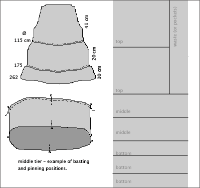
The Cutting
From a 220 cm length of 95 cm wide fabric, cut the following pieces (measurements are approximate):
- 2 - 63 cm W x 50 cm H
- 2 - 95 cm W x 28 cm H
- 3 - 95 cm W x 1/3 the remaining material (about 15 cm)
I used a ruler to measure and then folded the fabric and cut carefully on the fold. I'm a really lazy cutter!
The Sewing
- Sew the tiers into tubes on the short sides
- Hem the bottom one with a narrow hem.
- Sew a casing for elastic in the widest one.
- On the top edge of the middle and lower tiers, baste with contrasting thread, breaking the stitching at each side seam
- Mark the center, center back, and sides of each section with pins
- Pull the gathering basting on the middle tier up to meet the pins on the top tier
- Pin into place. I use 8-16 pins per tier to keep things from moving too much in the next step.
- Sew tier to top, keeping gathered side up. This helps prevent the edge of the gathers from folding over into the seam as you sew.
- Turn the seam allowance up. Press, if you desire.
- Topstitch seam allowance to previous tier.
- Repeat gathering and stitching for the lower tier.
- Fit elastic; thread through casing.
- Sew elastic together and close casing.
- Enjoy your skirt.
A couple of weeks ago, Tracey was asking me why some colors look better on people that other colors. "Maybe you can explain it on Creative Perspectives," she suggested. Well, that's a tall order--books have been written about color theory & professionals charge an arm and a leg to give you a personal color session.
But it's possible to explain the basics in short order. In fact, I had fun yesterday playing with a personal color palette.
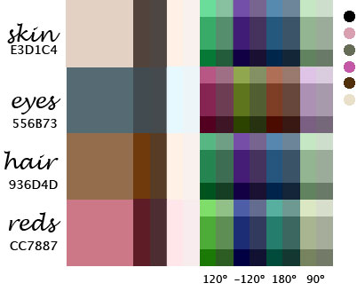
My personal color palette
First I took a close-up photo of myself in daylight. I brought into Photoshop and sampled the color my skin, eyes, hair and the red of my lips (which should be about the same color as when I blush).
From there I played with a nifty color tool Color Coordinator which allowed me to enter a color value (which I noted from my photoshop sampling) and view monochrome values (the first two columns above), alternate complements (120║ & -120║), complementary (180║), and one of the tetradic colors (90║) on the color wheel. I adjusted brightness in horizontal bands and saturation in vertical bands to give a wider range of examples for each color.
And it turns out that some of these colors are already in my wardrobe. I noted the general colors of my current wardrobe in dots along the side. I'm not doing too badly, though I suppose I need more blue in my life.
Over at iPod My Photo you can send in a digital picture and they'll turn it into an iPod style ad for you. It costs $20. If you have Photoshop and a little bit of time, you can do it yourself with respectable results.
The instructions that follow are for Photoshop CS on OS X. If you have a different version, ymmv.

How to iPod Your Photo
FIGURES
- Open the photo you want to use.
- Set your background color to a bright color ala the iPod ads. (According to Jennifer Apple, the real ad colors are: blue #1379F9, purple #9369BF, orange #F59110, green #9FCC39, pink #EB5297)
- Copy your original image into a new layer
- On the Background layer, Cmd-A then delete to remove the photo, leaving the colored background.
- On the photo layer, use the eraser, magic wand, and lasso selection tools to remove the background of your original photo, leaving only the people.
- If you have several disconnected figures in the photo, copy the original image onto new layers for each figure, then remove the background cruft so that each layer has only one figure on it. In the example below I made one layer for me, one for mom and one for my mother-in-law. When you've completed erasing the background, link the layers with the people and merge them back together.
- Image > Adjustments > Auto Contrast
- Image > Adjustments > Desaturate
- Image > Adjustments > Brightness/Contrast
- Contrast -50
- Brightness -50
- then adjust as desired

SHADOWS
- Duplicate the layer with the figures.
- Edit > Transform > Flip Vertical
- Position the shadow so it falls under the figure's feet, on the ground if the figure is jumping. If you have multiple disconnected figures, you may need to break the shadows apart to position them correctly.
- Image >Adjustments > Brightness/Contrast
- Contrast -50
- Layer > Layer Style > Blending Options
- Opacity 10%
- Filters > Blur > Gaussian Blur
- Radius pixels depends on your original image size...good and blurry!
- Now you need to remove most of the shadow.
- Set the Elliptical Marquee tool to a 20 pixel feather (you may need to adjust upwards fro downwards according to your photo size)
- Select a small area around the feet of the figure.
- Repeat for each separate figure.
- Select > Inverse
- Press Delete
iPOD
- Go to Apple's iPOD Gallery site.
- Arrange the iPod approximately how the figure will hold it.
- Cmd-shift-4 to take a screen shot
- Open the screen shot in Photoshop
- Use the Magic Wand to (set tolerance to 0) to select the white background, then Select > Inverse
- Copy the iPod and paste into your photo.
- Clean up any messy fringing with the Polygonal Lasso tool.
- Image > Adjustments > Desaturate
- Position and resize.
- Erase (or draw) fingers on the figure so it is holding the iPod.
- Repeat for additional iPods.
- Create a new layer for the earbuds and wires.
- Use the paintbrush tool (set to white) to draw in the wires and earbuds.
- Layer > Layer Style > Blending Options
- Opacity 90%
TEXT
- The font in the Apple ads is Myriad.
- A fair substitute is Helvetica.
- White, of course!
Now that you have a name for the dish, how should you describe it? It's a bit more challenging to explain how to write a description, but here are some pointers and examples.
Some menus don't use descriptions at all. This is fine if the name of the dish makes it obvious what it is. Vanilla ice cream probably doesn't need much more information, unless it's a an original recipe or served with optional toppings.
3 Points to Keep in Mind
- If you write a description for one entree or appetiser, you should write them for all the entrees/appetisers . Sides, desserts and beverages may not need descriptions, depending on how complex they are.
- Avoid vague adjectives. "Delicious chicken served with tasty potatoes" doesn't say very much about the dish.
- Shorter is usually better. Diners don't want to spend all night reading the menu! But some dishes require a bit more explanation than others--it's OK to vary the length.
How to Create a Good Description
What do you want to say about the dish?
- any of the elements you skipped in the name: region, cooking method, flavor, cut, or accompaniment
- side dishes included with the dish
- any original or unique aspects of the dish
There are two main ways to write desciptions: "straight" or "with personality."
Straight descriptions focus on the food, its flavors, ingredients, and preparation.
Descriptions with personality address the diner directly: "You'll love our smokey barbecue sauce"; "We combine potatoes and garlic to create the perfect mashed potato."
It's much harder to write descriptions with personality. You really need to know the restaurant's atmosphere and even then, striking the right chord is a challenge. If you're not sure, stick with straight descriptions. Personally, I find menus with too much personality a little annoying. Use sparingly.
Here are some examples, along with my comments:
Baked Chicken Breast with Chipotle Pepper Pasta
Example A:
Healthy, skinless, boneless chicken breast atop a bed of spicy pasta.
(Brief and to the point. Adds the idea that this dish is healthy and the pasta is spicy. Tells you where the chicken and pasta will be on the plate.)
Example B:
Smoky, spicy chipotle pepper pasta enhances a skinless chicken breast.
(Gives more detail about the pasta's flavor but "enhances" is perhaps more opinion than fact.)
Example C:
Homemade smoked pepper pasta accompanies a skinless boneless chicken breast flavored with garlic and sherry.
(Takes the name of the dish a little further and tells about the flavor and preparation of both the pasta and the chicken.)
Example D:
Succulent baked chicken rests on top of a bed of delicious spicy pasta. This dish is a winner!
(This is bad. Uses a lot of vague adjectives and says nothing about the dish that isn't already in the name.)
Example E:
Looking for a healthy option? This skinless, boneless chicken breast served over smokey spicy pasta cuts the fat without sacrificing the flavor.
("with personality" focusses on the health benefits of the dish while also giving a little more information than was in the name)
Grilled Rosemary Lamb Chops with Garlic Mashed Potatoes
Example A:
Three chops served with potatoes, a salad and today's vegetable.
(Brief. Tells how much lamb you get and what if comes with.)
Example B:
Three fresh Australian lamb chops grilled to perfection and served with mashed potatoes, a salad and the chef's choice of vegetables.
(Again, tells you exactly what you're getting. Also where the lamb came from. "to perfection" is perhaps more opinion than fact)
Example C:
Three Australian lamb chops rubbed with rosemary and garlic are served with flavored mashed potatoes, todays steamed vegetable, and a side salad complete with our exclusive raspberry-walnut dressing.
(Tells more about the preparation of the lamb and details of the side dishes)
Example D:
Juicy Australian lamb served with delectable mashed potatoes. Our chef's favorite meal.
(Bad. No information that's not in the name, unless you care that the chef likes it...)
Example E:
We fly custom-cut lamb chops from Australia, season them with rosemary and garlic then grill them to order. Paired with garlic mashed potatoes, a seasonal vegetable and our house salad.
("with personality" lets the diner know that the lamb is specially imported and gives the list of sides.)
Vegetable Lasagne
Example A:
Layers of pasta and cheese alternating with seasonal vegetables and tomato sauce.
(simple and to the point but missing detail on the vegetables)
Example B:
Tender baked pasta layered with ricotta cheese, mushrooms, green beans, eggplant, onion and a garlic-y tomato sauce. Served with garlic bread and a side salad.
(Better. Lists the vegetables and the sides)
Example C:
A vegetarian-friendly baked Italian classic made with cheese, mushrooms, green beans, eggplant, onion and a tomato sauce. Served with homemade garlic bread and a side salad with your choice of Italian or French dressing.
(Focus on the vegetarian aspect, with good detail on the ingredients and sides)
Example D:
Hearty and filling lasagne stuffed with vegetables.
(Bad. What does this say that the name didn't say?)
Example E:
Nobody ever goes home hungry after ordering our famous lasagne. Five layers of tender pasta, ricotta cheese, sauteed vegetables and tomato sauce are baked and served with garlic bread and a side salad. Mangia!
("with personality" gives good details and a little Italian flair.)
Recently, a friend asked me to give her some tips on creating menus for restaurants (though how she knew that this is something I've done I don't quite know). I wrote up a few short e-mail lessons that I thought I'd present to you. You never know when you're going to be called on to write a menu!
Introduction
You already know that all menus are divided into sections: appetisers/starters, salad/soup/sides, main dishes (sometimes divided by type of meat used or whether its pasta/rice/meat), desserts and drinks. I'm sure that's not something you need any instruction on.
Something that I probably can't help you with too much is food knowledge. A good knowledge of food is important to be able to write menus. What's the difference between a flan, a pudding and a custard? How is a soup different from a stew?
The best menus have two points for each dish - a name for the dish and a description. In "Writing menus - lesson 1" we'll focus on the name of the dish.
3 Points to Keep in Mind
- The name should clearly say what the dish is: Lamb with Lemon Sauce; Cajun-style Chicken; Fried Fish with Tartar Sauce. Unless the diner wants to know more, he can skim the names and figure out what to eat. If the dish as a classic or regional name, use it: Fettucini al Fredo; Eggs Florentine, Salad Niscoise; Cobb Salad. Then use the description to explain what it is (see lesson 2)
- Cute names are a bad idea. What is "Happy Chicken" or "Uncle Joe's Breakfast" or a "Friday Relaxer"? Meaningless. Diners have to read too much to find out. And they feel silly ordering them, too.
- Try to make each name easily shortened without any overlap with other dishes. "I'll have the lamb." "I'd like the chicken" "I'd like the fried fish, please." If there are two dishes with the same meat or main ingredient, be sure you identify each one by cooking method or flavor: grilled beef and stewed beef, for example.
How to Create a Good Name
You can't go wrong if you put the elements of the dish in this order:
Region + Cooking Method + Flavor + Main Ingredient + Cut + Accompaniment
You don't have to use all of them at once, though you'd be remiss not to include the main ingredient. Stick with the minimum needed to describe the dish clearly. For example:
New York Style Baked Cheesecake with Blueberry Sauce
(region, method, main, accompaniment)
Steamed Raspberry Pudding
(method, flavor, main)
White Chocolate Cake with Carmel Topping
(flavor, main, accompaniment)
Louisiana Barbecue Pork Ribs
(region, method, main, cut)
Chinese-style Pork Tenderloin
(region, main, cut)
Baked Chicken Breast with Chipotle Pepper Pasta
(method, main, cut, accompaniment)
Broiled Flounder crusted with Black Pepper
(method, main, accompaniment)
Stir Fried Shrimp and Asparagus over Angel Hair Spaghetti
(method, main, accompaniment)
Grilled Rosemary Lamb Chops with Garlic Mashed Potatoes
(method, flavor, main, cut, accompaniment)
Garlic Bread topped with Cheese
(flavor, main, accompaniment)
Vegetable Lasagne
(flavor, main)
Accompaniment can go in the description unless it's a major element of the dish, like "over angel hair spaghetti" or "topped with cheese" in the examples above. Include topping that adds to the flavor, like "blueberry sauce", "crusted with black pepper" or "carmel topping" above. No need to mention the parsley!
Distinguish the Ingredients
Be as specific as possible with the main. Not just "fish" but what kind of fish? What shape is the pasta - linguine, farfalle, penne, spaghetti? If it's a rice dish, what sort of rice is it - arborrio, basmati, wild rice? In Japan, you can leave off "Japanese" when writing about rice, because that's what everyone expects. But outside Japan there are lots of different rices.
The cut of meat is also important. Chicken legs and chicken breast taste different. I'd happily eat a grilled T-bone steak, but not a grilled rump roast.
Specialty Names and Descriptions
Here's a list of some of the classic descriptions. You can use these as shortcuts in your menu names, but be sure to explain what the dish is without the fancy name when you write the description. Below are some French terms and different cuisines all have their own specialised vocabulary!
xx Florentine (cooked with spinach)
xx Nicoise (with tomato, garlic, olive oil and, black olives)
XX Provencal (with garlic and olive oil)
xx a la mode (topped with ice cream)
And there are dozens of classic dishes that many diners will be familiar with, even though the names don't describe the dish explicitly. It would be strange to describe them using the method above. For example, lasagne. You could write it as Italian Pasta Casserole, but doesn't that sound wrong?
Lasagne, Ravioli, Pierogies, Naan, Palak Paneer, Waldorf Salad, BLT, Coq au Vin, Tacos, Burritos, Huevos Rancheros, Gazpacho...
There are many more descriptions and dish names, I've only listed some off the top of my head. There's an excellent dictionary of food terms here: http://www.cafecreosote.com/dictionary.php3
In the next lesson, I'll go over writing the descriptions to match the names.
It's nearly impossible to find free sewing patterns on the 'Net, so here are the patterns and how-to instructions for two styles of unisex casual pants I made yesterday. Now you can make your own.
Thai Fisherman's Pants
These are one-size fits-all pants that wrap around and tie with a sash. Very comfy and stylish, too. You can use almost any weight fabric--from silk to lightweight denim. The Thai ones are cotton or rayon. Make sure your fabric looks nice on both sides; I did mine with a contrasting top panel because the print I used for the legs looked ugly on the reverse.
You'll need
2 meters fabric
matching thread
About an hour.
Cutting:
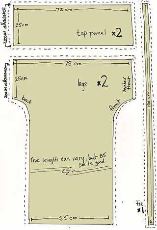
top panel (2): 25 cm x 75 cm
legs (2): 75 cm x 85 cm, with a curved 50 x 10 strip cut away on each side
tie (1): 6 cm x 140 cm
I measured and cut directly on the fabric without a paper pattern. Don't forget to add extra for the seams. I usually do 1 cm all around.
If you're using fabric with a directional pattern, cut the cloth in half widthwise and turn the fabric so that the pattern runs the same direction on both legs.
Construction:
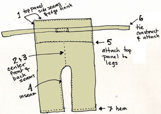
- Sew the short ends of the top panel to form a large hoop. Hem one edge of the hoop.
- Sew the center front seam.
- Sew the center back seam.
- Starting at the center and working out, sew the inseam.
- Attach the top panel to the legs.
- Construct the sash and attach to the top panel at the back.
- Hem the legs.
Points:
French seam the top panel sides so there are no raw edges.
Finish the top panel edge with a tiny hem.
Attached the belt securely to the center back of the top panel.
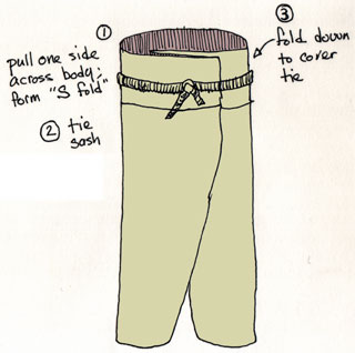
To wear them, slip them on and hold the edges out from you (like a diet "after" picture). Pull one side tight against your body and bring the rest of the fabric across yourself to form an S curve. Bring the ties around your waist and knot. Fold the top down over the ties.
Comfy Pants
These baggy pajama pants are derived from the mompe slacks in John Marshall's "Make your Own Japanese Clothes." An elastic waist makes them really easy to wear. You can increase the width of the leg opening to get a more skirt-like palazzo pant.
This pattern needs to be drafted onto paper, but it's not difficult to do at all. Once you've done it, you can use it over and over, or until you size changes.
You'll need
2.2 meters fabric, depending on your leg length
elastic for the waistband (your waist + 5 cm)
matching thread
a ruler
a calculator
a crayon or colored marker
a sheet or two of newspaper
tape
About 90 minutes.
Drafting:
Measure yourself (it's much easier if you have help with these!)
 Hips ________ cm
Waist to floor ________ cm
Crotch to floor________ cm
Around ankle and heel ________ cm
Now lay out your newspaper so that it matches the waist to floor measurement. Tape together if necessary.
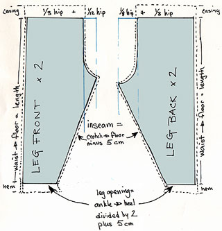
Front Leg:
- From one corner of the paper, measure 1/3 your hip measurement and mark it.
- Move over 1/12 of your hip measurement and mark that.
- At the 1/3 + 1/12 point, draw a line all the way down the paper.
- At the bottom, mark the width of the leg opening. (1/2 the ankle-heel + 5 cm)
- Calculate the inseam: crotch to floor minus 5 cm.
- Using a tape measure stretch to the inseam length, make a diagonal from the end of the leg opening to the 1/3 + 1/12 line.
- Draw a gentle J-shaped curve from the end of the inseam to the 1/3 mark.
Back Leg:
Same as the front leg, but use 1/3 plus 1/8 of your hip measurement. This allows a little extra room for your derriere.
Cutting:
Follow the pattern, adding seam allowance all around, plus about 8 cm at the top for the elastic casing and 5 cm (or more) at the bottom for a hem.
Construction:
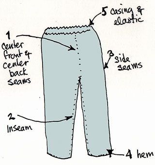
- Sew the center front seam and center back seam.
- Starting at the center and working down the leg, sew the inseam.
- Sew the side seams.
- Hem the legs.
- Construct the casing and thread the elastic through.
A Brief History of Zero
Kristen McQuillin, July 1997 (revised January 2004)
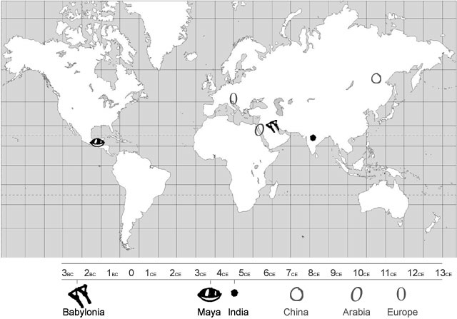
Once upon a time there was no zero. Of course people knew if they had nothing, but there was no mathematical notation for it. Zero was independently invented only three times.
The first recorded zero is attributed to the Babylonians in the 3rd century BC. A long period followed when no one else used a zero place holder. But then the Mayans, halfway around the world in Central America, independently invented zero in the fourth century CE. The final independent invention of zero in India was long debated by scholars, but seems to be set around the middle of the fifth century. It spread to Cambodia around the end of the 7th century. From India it moved into China and then to the Islamic countries. Zero finally reached western Europe in the 12th century.
Before you continue reading the history of zero, please be sure you understand these underlying concepts : Number vs Numeral; Invent vs Discover & Place Value Notation
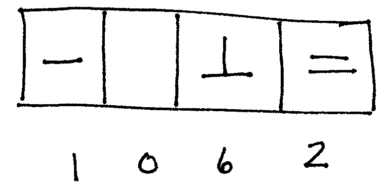
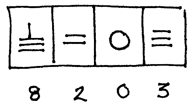
Babylonia: 300 B.C.
The Babylonians were the first culture to invent the place value system. They had a sexigesimal number system, that is, they counted in 60s, as we count in tens. When you count minutes in an hour or measure circles you are thinking in sexigesimal.
Of course the Babylonians didn't use our numerals. They wrote in cuneiform, a writing system optimized for writing in damp clay tablets. They used two symbols to represent all the numbers from 1 to 59. The wedge was used for a one and the crescent equalled a 10. By grouping them together, they created symbols for all 59 numbers.
5 crescents + 4 wedges = 54
Beginning at 60, we see a place value. The number 61 would be written with one wedge to the left (1 sixty), and one to the right (1 one).
The number 124 (2 sixties + 4 ones)
The number 1856 (30 sixties + 56 ones)
And here's the challenge that leads to the invention of zero. How do you indicate that there's nothing in a particular place? How would you show the number 3604? 3604 is 1 "60 squared" + 4 ones but nothing in the sixties column. Well, scribes started leaving a blank space. But not all of them did that and even when they did sometimes it was a pretty small space--it was difficult to tell it was there. So one very bright scribe put in a symbol that already existed as a separator in literature, a sort of sideways, superscript, double wedge. Now it was easy to distinguish whether you meant 3604 or 64:
top: 64 (1 sixty + 4 ones)
bottom: 3604 (1 sixty2 + 0 sixty + 4 ones)
Babylonian mathematicians used the separator (effectively the first zero) in the middle position only. The person doing the calculations knew what order of magnitude he was working with and didn't add any separators at the end of his notations. However, the astronomers started using the zero placeholder in at the end and at the beginning of notations. This allowed them to note fractional degrees and minutes of arc and made their computations more accurate.
Despite the invention of zero as a placeholder, the Babylonians never quite discovered zero as a number. On an accounting tablet recording the distribution of grain there is a notation at the end of a column of numbers that reads "The grain is exhausted." Another example from the same era is a description subtracting 20 from 20: "twenty minus twenty...you see."
Although we have evidence of zero from tablets in the Selucid era (4th to 1st C BC), it is possible that the zero was invented before that time. Many of the Seleucid era tablets are copies of much older documents. We'll never know for certain, so we place the Babylonia zero around the 3rd century BC.
Central America: 350 CE
 The Mayans, native inhabitants of
Central America, were highly skilled mathematicians, astronomers, artists
and architects. However, they failed to make other key discoveries and inventions
that might have helped their culture survive. They never used the plow or
metal tools and their civilization collapsed mysteriously around 900 CE.
The Mayans, native inhabitants of
Central America, were highly skilled mathematicians, astronomers, artists
and architects. However, they failed to make other key discoveries and inventions
that might have helped their culture survive. They never used the plow or
metal tools and their civilization collapsed mysteriously around 900 CE.
They had a very complex calendar system and needed a placeholder in their elaborate date system. This lead to their invention of zero--600 years and 12,000 miles removed from the Babylonians.
The Mayans had several calendars. There was a 365 day civil year, a 260 day religious year and, key to their invention of zero, the complicated Long Count calendar which measured time from the start of the Mayan civilization (August 12, 3113 B.C.) and completes a full cycle on December 21, 2012.
Mayan Long Count Units | ||
|---|---|---|
kin |
day |
|
unial |
month |
20 days |
tun |
year |
360 days (18 months) |
katun |
20 tuns |
7200 days (20 years) |
baktun |
20 katuns |
144,000 days (400 years) |
pictun |
20 baktuns |
2,880,000 days (8,000 years) |
calabtun |
20 pictuns |
57,600,000 days (160,000 years) |
kinchiltun |
20 calabtuns |
1,152,000,000 days (3,200,000 years) |
alautun |
20 kinchiltuns |
23,040,000,000 days (64 million years) |
It is the formal Long Count calendar that brought about the zero. The Mayan numerals were very complex in formal use--painted or carved heads or even full figures were used to represent numbers. When using these ornate carvings on a stelae, or stone tablet, the Mayans had a rather rigid graphic layout; each period of time had a space and all the spaces needed to be filled in. So a date that was 8 baktuns, 14 katuns, 3 tuns, 0 unials and 12 kins had to have one figure for each place. The zero was often represented by a shell shape.
Despite the use of zero in the place value system, it was never used for calculations. Once again, this stems back to the calendar. You may have noticed in the chart above that a 360 day year is 18 months (20 days to a month). This irregularity messed up an otherwise tidy vegisimal (base 20) system:
Decimal 10 is (1 x 10) + (0 x 1) = 10
Vegisimal 10 is (1 x 20) + (0 x 1) = 20
Mayan 10 is (1 x 20) + (0 x 1) = 20
Decimal 100 is (1 x 10exp2) + (0 x 10) + (0 x 1) = 100
Vegisimal 100 is (1 x 20exp2) + (0 x 20) + (0 x 1) = 400
Mayan 100 is (1 x (18x20)) + (0 x 20) + (0 x 1) = 360
Decimal 1000 is (1 x 10exp3) + (0 x 10exp2) + (0 x 10) + (0 x 1) = 1000
Vegisimal 1000 is (1 x 20exp3) + (0 x 20exp2) + (0 x 20) + (0 x 1) = 8000
Mayan 1000 is (1 x (18x20exp2)) + (0 x (18x20)) + (0 x 20) + (0
x 1) = 7200
India: 458 A.D. (debated)
 The final independent invention of
the zero was in India. However, the time and the independence of this invention
has been debated. Some say that Babylonian astronomy, with its zero, was
passed on to Hindu astronomers but there is no absolute proof of this, so
most scholars give the Hindus credit for coming up with zero on their own.
The final independent invention of
the zero was in India. However, the time and the independence of this invention
has been debated. Some say that Babylonian astronomy, with its zero, was
passed on to Hindu astronomers but there is no absolute proof of this, so
most scholars give the Hindus credit for coming up with zero on their own.
The reason the date of the Hindu zero is in question is because of how it came to be.
Most existing ancient Indian mathematical texts are really copies that are at most a few hundred years old. And these copies are copies of copies of copies passed through the ages. But the transcriptions are error free...can you imagine copying a math book without making any errors? Were the Hindus very good proofreaders? They had a trick.
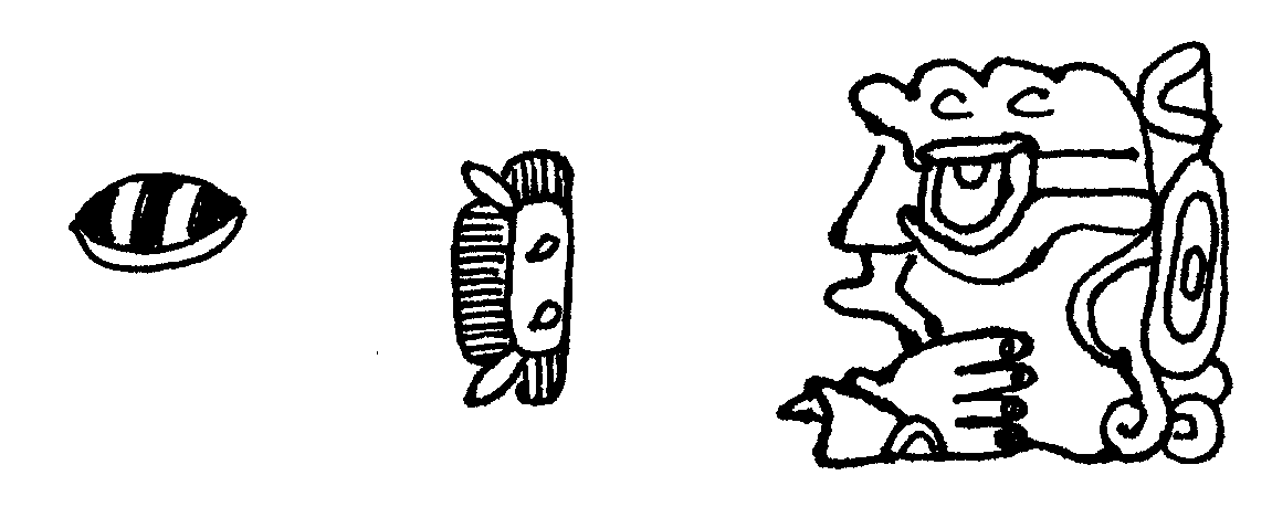
Math problems were written in verse and could be easily memorised, chanted, or sung. Each word in the verse corresponded to a number. For example,
viya dambar akasasa sunya yama rama veda
sky (0) atmosphere (0) space (0) void (0) primordial couple (2) Rama (3)
Veda (4)
0 0 0 0 2 3 4
Indian place notation moved from left to right with ones place coming first.
So the phrase above translates to 4,230,000. 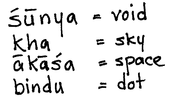
Using a vocabulary of symbolic words to note zero is known from the 458 AD cosmology text Lokavibhaga. But as a more traditional numeral--a dot or an open circle--there is no record until 628, though it is recorded as if well-understood at that time so it's likely zero as a symbol was used before 628.
Which it probably was, considering that 30 years previously, an inscription of a date using a zero symbol in the Hindu manner was made in Cambodia.
A striking note about the Hindu zero is that, unlike the Babylonian and Mayan zero, the Hindu zero symbol came to be understood as meaning "nothing." This is probably because of the use of number words that preceded the symbolic zero.
Spreading Outward: China, Arabia and Europe
The Hindus influenced the numeration of nearby locales, and introduced the zero to the Chinese and to the Arabs who developed the modern day shape of numerals and passed them, along with zero, to the Europeans in the 12th century.
Although China independently invented place value, they didn't make the leap to zero until it was introduced to them by a Buddhist astronomer (by way of India) in 718.
Although it seems strange to image a place value system with no place holder for "nothing," it makes perfect sense when you see the Chinese method for writing and calculating numbers.
The Chinese used a counting board to do their mat, and an additive system to write their numbers. There was a symbol for 1 and a symbol for five and these symbols were added together to form symbols for other numbers up to 9. The numbers were actually rods arranged on a counting board which ran from left to right. Any missing places were left blank on the counting board. After the introduction of the zero symbol, the counting board could be retired. Numbers could be written on paper without the need of little rods and counting boards.
Arab countries in the MIddle East also got their zero from Indian scholars. Arab mathemeticians created a new form of writing numbers--the Arabic numberals we still use today. When Europe and the MIddle East began trade on a large scale, Europe adopted Arabic numerals and abandoned counting boards.
Underlying Concepts
"It must have required many ages to discover that a brace of pheasants and a couple of days were in both instances the number two."
Bertrand Russell
Number vs. Numeral
A number is a quantity, an abstraction of a collection of things; a numeral is a man-made symbol that represents the number.
 Numerals (symbols)
from various cultures look different, but all express the same number. Some
are very complex, others are simple dots or circles. All four of these are
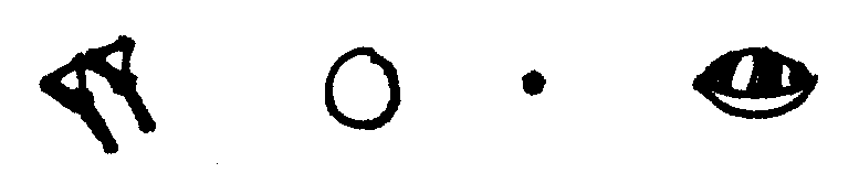
symbols for the number zero. L to R they are from Babylonia, China, India
and Central America. Words are also symbols that express numbers, but we
don't call them numerals.
Numerals (symbols)
from various cultures look different, but all express the same number. Some
are very complex, others are simple dots or circles. All four of these are
symbols for the number zero. L to R they are from Babylonia, China, India
and Central America. Words are also symbols that express numbers, but we
don't call them numerals.
Numbers (quantity) are always the same value, no matter what symbol or word is used to represent them. Uno, bindu, ichi, 1, single, solitary. All of these symbols represent the concept we know as "one." The quanity does not change, even when the symbol is different.
Zero is a special case. Constance Reid, in From Zero to Infinity shows the difference between number and numeral with a set of simple math problems. It is easy to use zero when it is a symbol, but not always so easy to calculate with zero the number. What are the answers to the following math problems?
Zero as Symbol |
Zero as Number |
1 + 10 = |
1 + 0 = |
10 - 1 = |
0 - 1 = |
1 x 10 = |
1 x 0 = |
10 / 1 = |
0 / 1= |
[Answers. symbol column: 11, 9, 10, 10. number column: 1, -1, 0, 0]
Invent vs. Discover
invent (v.) think up or mentally fabricate, esp a new device or
contrivance. The numeral zero (symbol) was invented.
discover (v.) to be the first to find out, see or know about; to
realize. The number zero (abstract) was discovered.
Place Value Notation
Place value notation uses numerals in different positions to represent different numbers. You may recall learning about the "tens" place and the "ones" place in elementary school; this is place value notation.
Our system uses place value notation; for example, 32 means "three tens and two ones."
|
Tens |
Ones |
3 |
2 |
Place value notation is how zero was invented. It was a symbolic placeholder for an empty place (for example 302 or 3200). Previous to the invention of zero, either number might have been written as 32, leaving the reader to figure out the number from context. Zero was a big improvement for accurate accounting!
In most systems that use place value notation, the places are the exponents of the base. In our decimal (base 10) system we have places for: 1, 10, 10 squared (100), 10 cubed (1000) and so on. In a sexigesimal (base 60) system, the places are 1, 60, 60 squared (3600), etc. In a base 20 system: 1, 20, 20 squared (400), 20 cubed (800), and so on.
Value "Four hundred and twelve" in Base 10 & Base 60
DECIMAL |
10 squared place |
Tens place |
Ones place |
| 4 | 1 | 2 | |
SEXIGESIMAL |
60 squared place |
Sixties place |
Ones place |
| 6 | 52 |
Numerals 4-1-2 in Place Value Notation
DECIMAL |
10 squared place |
Tens place |
Ones place |
| 4 | 1 | 2 | |
SEXIGESIMAL |
60 squared place |
Sixties place |
Ones place |
| 4 | 1 | 2 |
 Tackling Movable Type templates and CSS for the first time can be daunting. The MT default templates contain four kinds of code: CSS, HTML, MT tags, and Javascript.
If you're new to all this, you're about to learn that it pays to make a careful study of the code. Once you understand the way it works together, it's pretty easy to modify your MT templates to display almost any design you want.
Understanding the Divisions
Let's start by taking a look at what the different sections are and what the code does. I've broken apart the default template in an illustrated way. This isn't exactly a Movable Type tutorial, but it does point out where the divs are and what the tags look like in code and rendered in the browser.
This diagram shows where the div sections of the MT index template begin and end. (Please click to open a larger version in a new window.)
 Positioning with CSS
Want to move these three major sections to different locations on your page? Start by modifying the style sheet entries for #banner, #content, and #links.
Most of the positioning elements in this stylesheet are margins and padding. Note that when a margin or padding is specified with four values, the order is always TOP, RIGHT BOTTOM, LEFT. If only one value is specified, it applies to all four sides equally.
Almost anything on your page can have margins and/or padding added to it--images, forms, tables, paragraphs. Usually margin and padding are mixed in with the formatting elements that control color, fonts and so on. In the examples, I removed the formatting controls as they rarely cause confusion once you understand positioning.
Margins and padding are nearly interchangable. The main difference is that if you've specified a background color in your style, padding adds an edge of the background color, but margins do not.
There are several other positioning elements that are crucial to the overall layout of the MT default index page.
Position:absolute This is used by the #content element and it means that #content ignores where other things are on the page and puts itself where you specify based on margins of its "parent." In the default MT index template, the #content element is absolute in relation to the
tag. It's 225 px from the left margin, which leaves room for the left-side links section.Position:relative This is the opposite of position:absolute. Relative positioning lets you shift an element on the page in relation to the things around it.
Float:left Floats are a little confusing, but if you've ever wrapped text around an image in Word, PageMaker, or a similar program, you'll understand the basic concept. In CSS, anything can be floated--images, paragraphs, headings, divs. Float can create some surprising and bad layouts, partly because not all browsers (including IE6) support them well, so read up on float before you start using it. And be prepared to test in many browsers to make sure it looks OK.
Width:200 This is used in the #links style in the default template. It ensures that the links section doesn't overflow into the #content section (which is 225 pixels from the left margin)
One final note. The difference between # and .
#name -- ID -- used only once per document
.name -- CLASS -- used as many times as needed in the document
This is not everything there is to know about positioning. For more details, check out Eric A. Meyer's comprehensive (but a little daunting) CSS books. For up-to-date online help, Google for CSS positioning tutorial.
A Positioning Example
To move the "links" column to the right instead of the left (MT's default), you need to edit #content and #links in the style sheet. In #content you change the position to relative and add a float and a width. You also change the values for the margin. In #links, you remove the width and adjust padding:
|
|
#content { #links { | #content { #links { |

 Formatting the Blog Entry
After you have the major divisions sorted, you can focus on formatting your blog entries. Changing the way the blog entry looks requires a mix of the style sheet, special MT tags and HTML.
There are three things you might want to do to format your blog entry:
- Adjust the text displayed (Format the date as 2003-08-14) - MT Tags
- Change the fonts, color, spacing, etc., of the text - CSS
- Move the text to another place in the entry - HTML template
All the sections of the entry (the date, title, body, extended entry link, posted, comments link, and trackback) follow a similar pattern: to change the text displayed take a look at the options for the MT tag and change the template; to change the way the text looks, change the CSS and to move the data around within the entry, cut and paste within the template HTML.
Let's take one section of the entry as an example:
Entry Date
To change the text of the date, you change the <MTEntryDate format="%x"> by substituting something else for the %x. All the date format codes are in the MT Manual.
To change the font and color of the date, you edit date in the style sheet.
date {
font-family:palatino, georgia, times new roman, serif;
font-size: large;
color: #333;
border-bottom:1px solid #999;
margin-bottom:10px;
font-weight:bold;
}
To change the location of the date within the entry, cut these lines from the HTML, and paste them where you want the date to appear. These lines must stay inside the MTEntry.
<MTDateHeader>
<h2 class="date">
<$MTEntryDate format="%x"$>
</h2>
</MTDateHeader>
More Study Examples


I took the screenshots from Jason Cha's Japan Blog, Philip Hill's Grandfather Philip, and my own Media Tinker weblog. Thanks to Bob McDonald, Rudolf Ammann, Gary Lawrence Murphy and Olivier Thereaux for their helpful suggestions.
Every time a phone rings, I jump. For as long as I can recall, the blare of the telephone has startled me. I'm often on edge in trains, on the streets, in shops and during meals out and about in Tokyo, because other people's keitai are always ringing. To keep myself from leaping when my own mobile rings, have volume set low and I've programmed my own ring.
The interface for entering your own musical ring tone is full-featured but tedious. I can make a five-part melody by keying in every note, the rests, sharps and flats in what seems like an andless series of button presses. But I want a ring, not a symphony, so I've devised a clever hack. I start the music interface and type in some words.
Without caring at all what the notes will be, I type in names or phrases. I've done this several times now, an they turn out surprisingly well, especially when I add a touch of harmony by using two voices of my 5-part allowance. My phone sings out "Answer me, answer me" like a calm, tinkling brook. I'm hardly startled at all anymore.
Download the PDF, includes exercises (401 K)
What are ōusabilityö and ōuser interfaceö?
Usability is the ease-of-use factorŚhow simple is it for your audience to do the things they need to do on your site? Can they find the information they want, buy a product, search, and send feedback to you? The clearer and simpler your site is to use, the better your usability and the more satisfied your audience will be.
User interface is what your audience sees Śyour logo, recurring graphics, theme colorsŚand the tools they use to interact with your siteŚnavigation buttons, search boxes, and even their own browser. User interface is everything except for content (and even thatÆs debatable).
Designing for Usability
Usability encompasses a few main aspects:
- Universal access
- Ease of navigation
- Attractive design
- Loading time
Universal Access
When you plan your site, you might be lucky and know exactly who your audience is; but most of the time you wonÆt. Universal access takes into consideration that users have different screen sizes, browsers, and abilities.
To make your site viewable to the widest audience, think about these things:
- Page size. This means with width of the page as well as its length. For people with smaller monitors, wide graphics will require horizontal scrolling. ThereÆs no completely foolproof size, but popular sites use graphics that are 480, 600 or 800 pixels wide. I prefer smaller to larger.
- Standard HTML. Both Netscape and IE have special HTML tags that work exclusively in their browser. If you rely on them to convey your message, some of your audience isnÆt going to see what you intend. Try to avoid using them.
- Plug-ins. Unless your site has a real need for cutting-edge technology, think twice before incorporating it into your site. How many users are really going to download the plug-in so they can see a 3-D model of your office? Not very many, unless the design of your office is the message of your website.
- Browsers. Netscape, IE, Opera, Mozilla, Lynx, and other browsers interpret even the standard tags differently. What may be Bold and 14 point on one machine will be Italic and 16 point on another browser. You cannot control this, but you can learn to design so that differences like this donÆt matter so much.
- OS Differences. The biggest difference between Macs & PCs is their screen resolutions and font sizes. Mac fonts look smaller; PC fonts display larger. Your lines will break in different places; paragraphs will fill different amounts of space. DonÆt count on your text looking exactly the same on every computer!
- Disabilities. Not every user is going to be able to see, hear or be completely mobile. Even if your target audience isnÆt the disabled population, itÆs not much trouble to add features to help out those who cannot see your graphics. Adding a simple alt=öLinks Buttonö to the img tag will allow web-reading programs to interpret the buttons.
Ease of Navigation
There are a number of ways to make your site easy to navigate.
- Use multiple methods of navigation. In addition to buttons and text navigation, include a site map or directory and a search function. Users have different approaches to navigation; itÆs a good idea to satisfy them all, if possible.
- Give the user what she expects. Search boxes are in the upper right corner of the page on most sites. If you put yours there, too, users will find it easily. Use standard icons for navigation instead of making up your own. For most users, a magnifying glass means ōsearch;ö a house means ōhome page.ö A blue balloon? An animated duck? These donÆt mean anything as navigation buttons.
- Be consistent. Navigation should be in the same place on every page and it should not vary in order of items or anything else that might cause the user to click on the wrong link or get frustrated.
- Stabilize. After youÆve designed the navigation of your site, donÆt change it. Of course, you may need to tinker as you add new sections or delete content, but your careful planning in advance will keep you from having to make major overhauls.
- Double-check every link and button works correctly!
Attractive Design
Even the most perfectly well organized site will fail if it doesn't look nice. Aesthetics are a matter of personal taste balanced with the prevalent idea of beauty, but there are a few things that you can do to ensure your site will look nice:
- Select your colors carefully. Be sure you have a good range of light and dark colors for contrast. Colors can be similar (orange and yellow), contrasting (blue and orange) or complimentary (yellow and violet)
- Use graphics to give the readerÆs eye a rest or to focus attention.
- Remember that white space is a valid design idea, but that with pages as small as a monitor, you must carefully balance space and content.
- Avoid amateur graphics and donÆt resize images to be larger than the original.
- Animation focuses attention; use it extremely sparingly.
Loading time
Have you ever waited for a long time for a web page to load? IÆm the sort of person who either gives up after a few seconds and clicks Stop or lets it load in the background while I do other thingsŚusually forgetting that I wanted the page at all.
What makes pages load slowly? Some of the issues are out of your control, like bandwidth and network congestions, but there are some things you can do to make sure your pages are zippy.
- Optimize your graphics. You can do it by hand, calculating the math yourself then saving the file as the right type and compression, or you can get a program like Adobe Image Ready or Macromedia Fireworks. These make optimizing very easyŚyou can compare the image quality and file size of several versions of your image at once, then save the best one.
- Use height and width attributes with your img tags. This allows the text of the page to load while ōholding a placeö for the image while it downloads.
- DonÆt use too many graphics. ThatÆs not to say donÆt use any, but itÆs a good idea to use them wisely. 50 1K files take longer to load than 1 50K file because the server must be contacted 50 times instead of once.
- Remove extraneous HTML. Some web editors are notorious for writing bad code. Instead of <p> they use two <br> or they add font tags to every single paragraph or they bloat the header with meta tags. All these little things can add up to a second or two of download time.
- DonÆt try to put everything on one page. If youÆve got a book to publish, break it into chapters. Loading one chapter will take much less time than loading the whole book.
User Interface Planning
ItÆs important to plan what youÆre going to do before you begin development. Good planning allows you to be consistent when you add more content and information in later stages. And if youÆre working with a team to do your site, planning ensures that everyone is following the same ideas.
Planning Stage 1: Content
Content is how you deliver the message of your website, so itÆs key to have a clear focus. What are you trying to say to your audience? Can you sum up the ōmissionö of your website in two sentences?
Examples
ōdigitalevejapan.org publishes information about DigitalEve JapanÆs events, projects and membership. The website is bilingual and includes interactive registration for events.ö
ōKristenÆs Japan keeps friends, family and the curious reader entertained with daily snippets from my life. In addition, longer, illustrated essays give an in-depth picture of aspects of living in Japan.ö
ōMediaTinker.com showcases the products and services of our company. Pricing and contact information are available as well as tutorials by our staff and links to business partners.ö
Planning Stage 2: Structure
Organizing the structure of your website is a two-fold process. You must consider your audienceÆs needs first. What do you think will be most important to them?
Keep in mind that what a user needs is probably not the same as the structure of your organization. If we arranged the DigitalEve Japan website based on the steering committee, our members would have a difficult time finding out about our workshops. HereÆs what might be, compared to what currently is:
DE-J Steering Committee Organization
Co-Leaders' page
TreasurerÆs page
PR page
Sponsorship page
Web Content page
Audience-based Web Organization
News & Home
About Us
Join Us
Events
Contact Us
If you are planning a corporate or organizational website, you may want to conduct focus groups or interview some of your users to find out what they think is important or useful. You might be surprised at what they suggest.
Once you have an idea in your head, you should put it on paper. Not only does this help you fill any gaps you may have forgotten, but it gives everyone involved in the construction of the site a guide to follow.
There are many ways to sketch out this plan. You can use a simple list, as above. A flowchart can be helpful if you need to lead the audience through steps, such as registering or purchasing something online. Another technique that is helpful at the beginning stages, especially when you have a lot of information to organize, is mind mapping.
Planning Stage 3: Navigation
Navigation is the final key point in your user interface. This is how your audience will move around in your site and it includes all the clues they will have too show them where they are (and where they can go).
Here are some standard navigation techniques; you can incorporate as many as makes sense for your site:
- Navigation Buttons. These might say Next, Home, E-mail Me, or Products
- Textual Navigation is an alternative to buttons or graphics. If you use buttons, itÆs a good idea to include text, too, as an aide for anyone who has trouble with graphics.
- Search is invaluable if you have a large site or one with lots of content buried deep. While some users enjoy browsing to find what they want, busy users want to get there quickly.
- Site Maps. These graphical representations of the structure of the site were popular several years ago, but have fallen out of favor. However, they can be useful as a secondary navigation method to show an overview of whatÆs in each section of the site.
- Index/Directory. Lists can help a user pinpoint a topic. Unless your site is a deep or broad portal, this is probably best as a secondary method
- Themes. Although these are rarely appropriate, if your site has a specific metaphor that can be graphically integrated into navigation, it can be a fun and natural way for the user to navigate. However, trying to force your siteÆs content fit your theme can be painful, limiting and confusing to the audience if it doesnÆt work perfectly.
Incorporating navigation ōcluesö can help your audience identify where they are in your site:
- URL. You will not always be able to give your page a meaningful URL, particularly if you are working with a database, but compare these two URLs. Which gives you more information about the page?
http://www.blah.org/tokyo/maps/shinagawa.html
http://www.blah.org/map.html
- Page Title. The title of a page appears in the browser window, not actually on the page. This is what is used to create the entry in your Favorites or Bookmarks. So itÆs key to make it meaningful. An example comparison:
Welcome!
DigitalEve Japan: Event Calendar
- Page Heading. This is the heading on the page itself. It should let the audience know exactly where they are. Event Calendar, DigitalEve Japan Contact Information, or
- Breadcrumbs. These are usually generated by a database-driven website. YouÆve seen them at sites such as Yahoo!.
Home > Society and Culture > Cultures and Groups > Women >
- Highlighted navigation items. Either the current location is ōgrayed outö that is, it cannot be selected in the navigation area, or it is made more prominent.
Organizing navigation should be a priority when you start designing your site. Take a look at sites you like and especially ones you think are easy to navigate then copy the best ideas to use on your own site. Remember that even though unique design can help your site stand apart from other sites, confusing the users with bad navigation means nobodyÆs going to stay very long to read what you have to say.
Points to consider
- Where to place the navigation text or buttons. At the top or bottom of the page? Down one side? In a frame? Inside a table? Try to keep navigation ōabove the foldö on your pageŚthat is, it should appear in the first screen of information without having to scroll down
- How many levels to include? On digitalevejapan.org, we have only the section names as navigation on each page, but we could add more detail:
About Us
- DE-J History
- Member Profiles
Events
Calendar
- Registration
- Photo Archive
- Class Materials
- What information should be searchable? Should the search box appear on every page, or do you want a special page (with instructions, hints, etc) to search from?
References
Designing Web Usability. Jakob Nielsen
Although Nielsen takes a stark and unappealing approach to graphical design, much of whatÆs described in this book is solid, practical information about creating a highly usable website. Just donÆt believe him when he talks about anything involving graphics.
Designing Web Graphics 3. Lynda Weinman
Lynda has been working with and writing about web design for many years and this book is the most referenced one on my shelf. She discusses planning, aesthetics and execution of web graphics.
The Design of Everyday Things. Donald Norman
Although this slim volume doesnÆt talk about the web at all, it is an excellent introduction to why itÆs important to make things (anything at all) user-friendly.
Envisioning Information. Edward Tufte
This is one of three definitive references by Tufte. In this one, he shows different techniques to present information visually. If youÆre planning to add charts, graphs or other information-rich graphics to your website, reports or other publications, this book will give you a solid understanding of the basics.
Originally presented at the Digital Eve Japan WomenÆs Web Retreat
June 23-24, 2001
Alishan Conference Center
Koma, Saitama
